Full Case Study: This project is large feature wise. If you wish to review, please have a look below with the same password as this site:
Nova (TrueSpark)
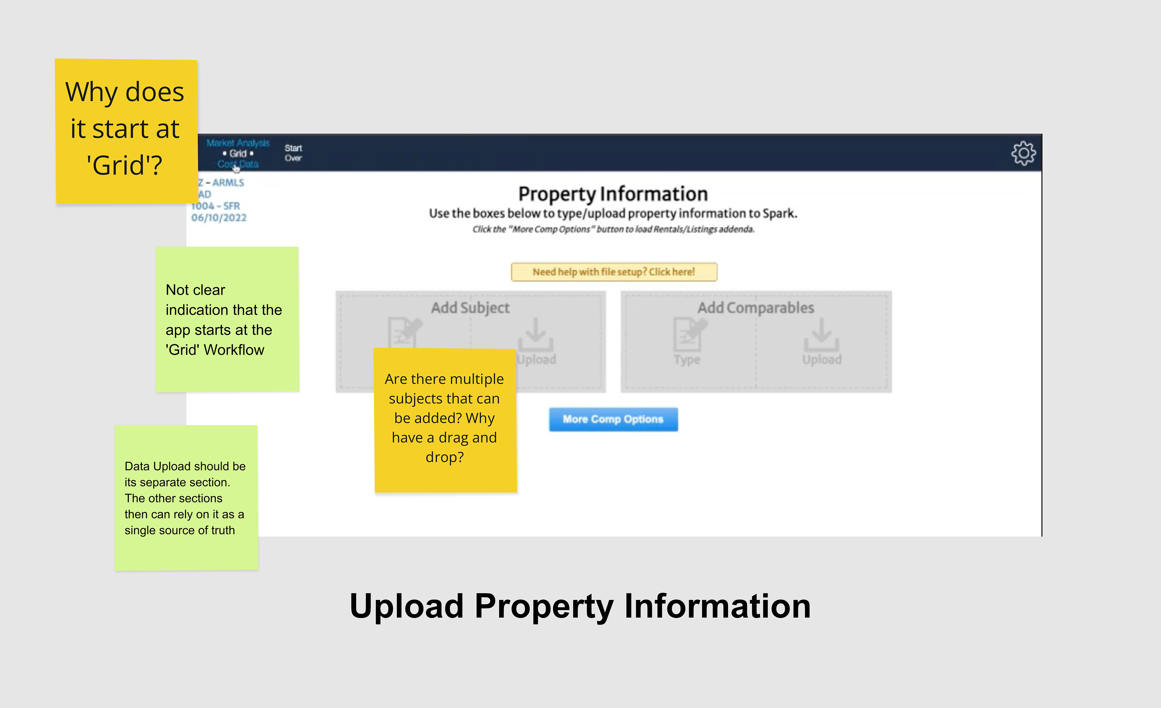
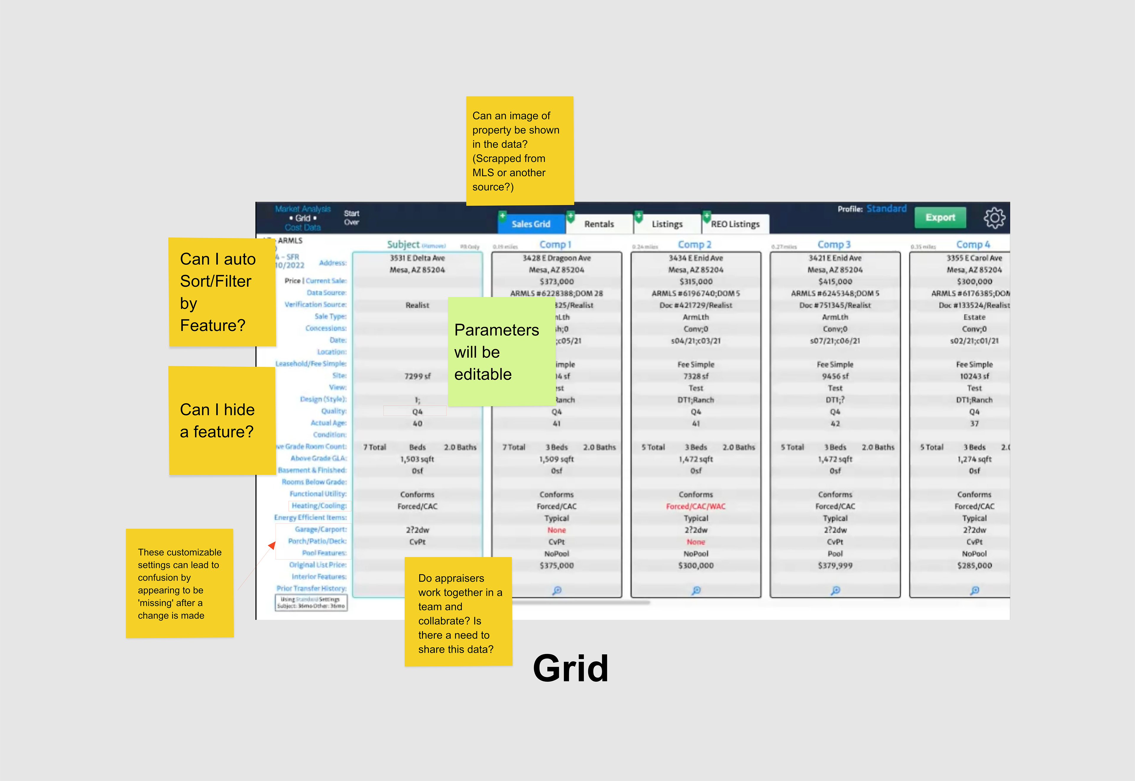
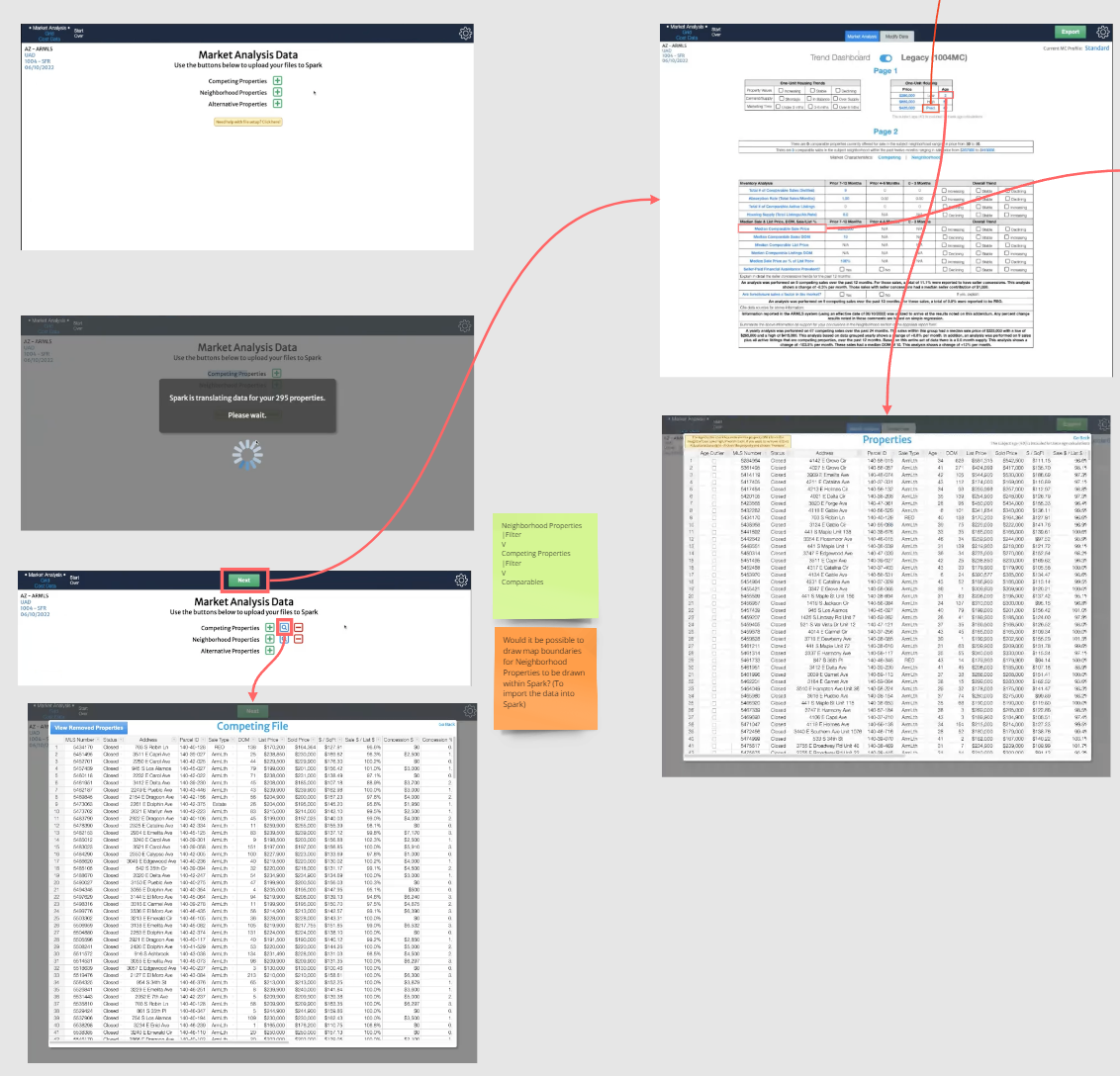
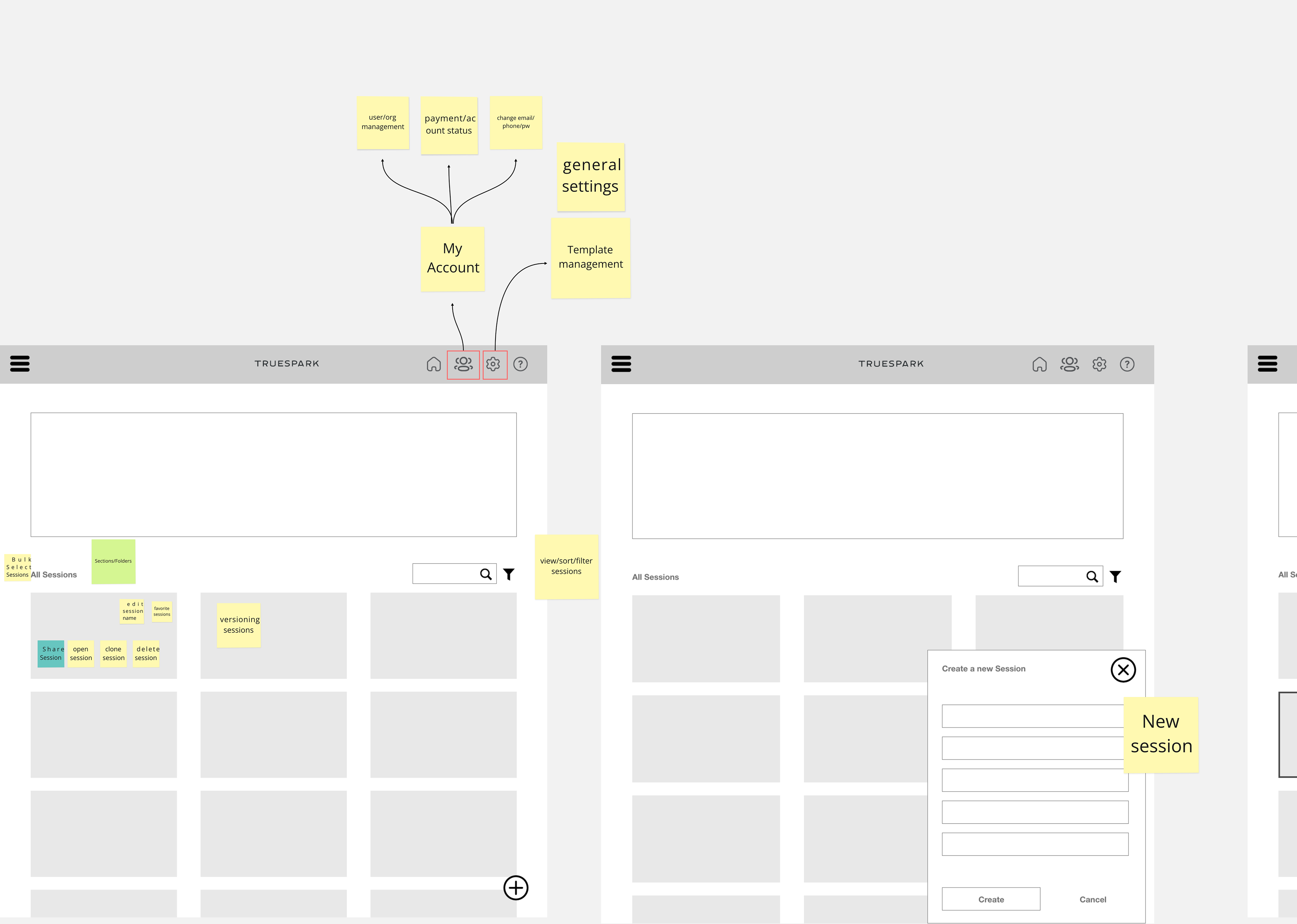
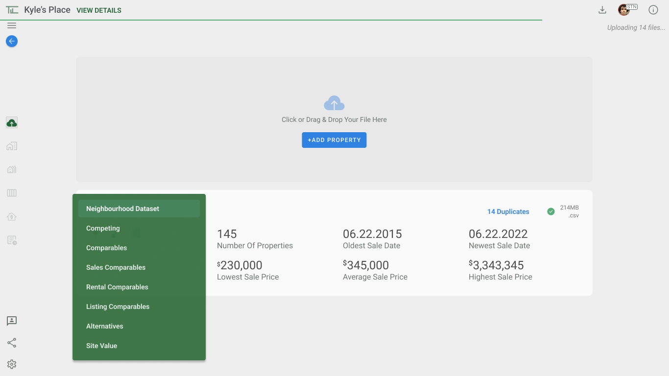
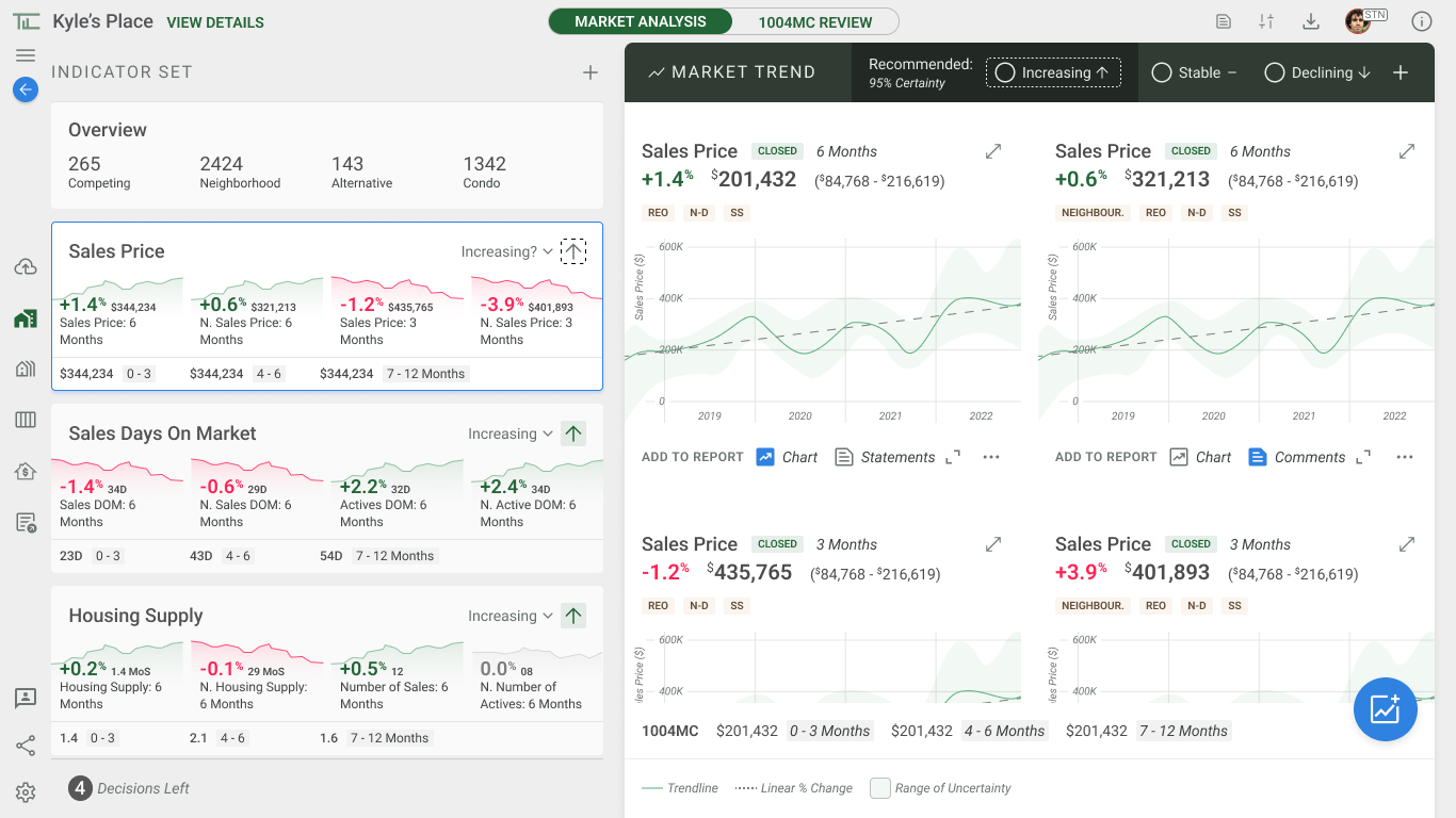
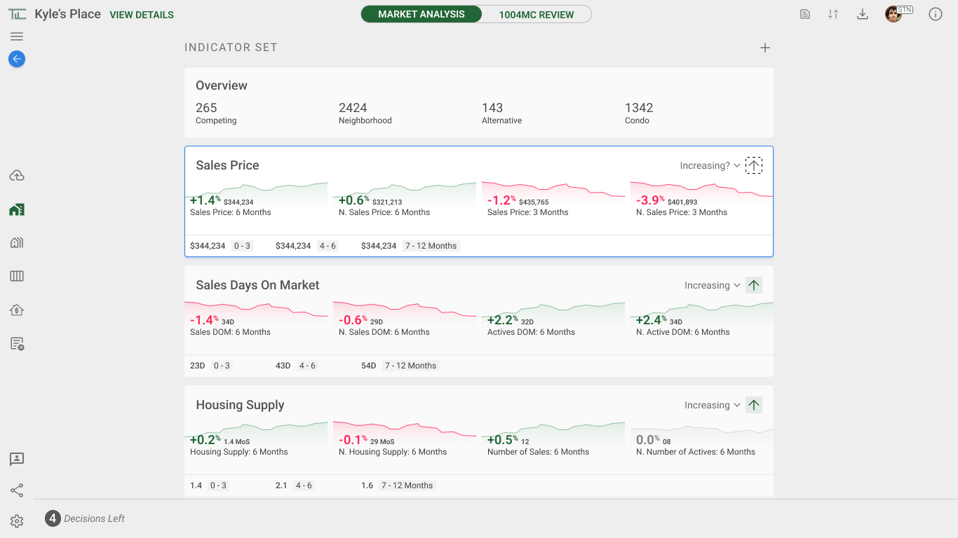
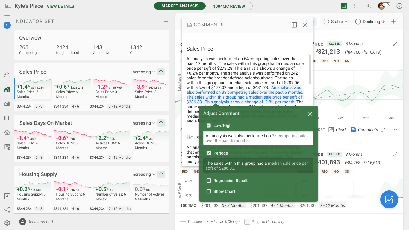
Snippet of the Market Analysis, with functionality that can be done for each page.
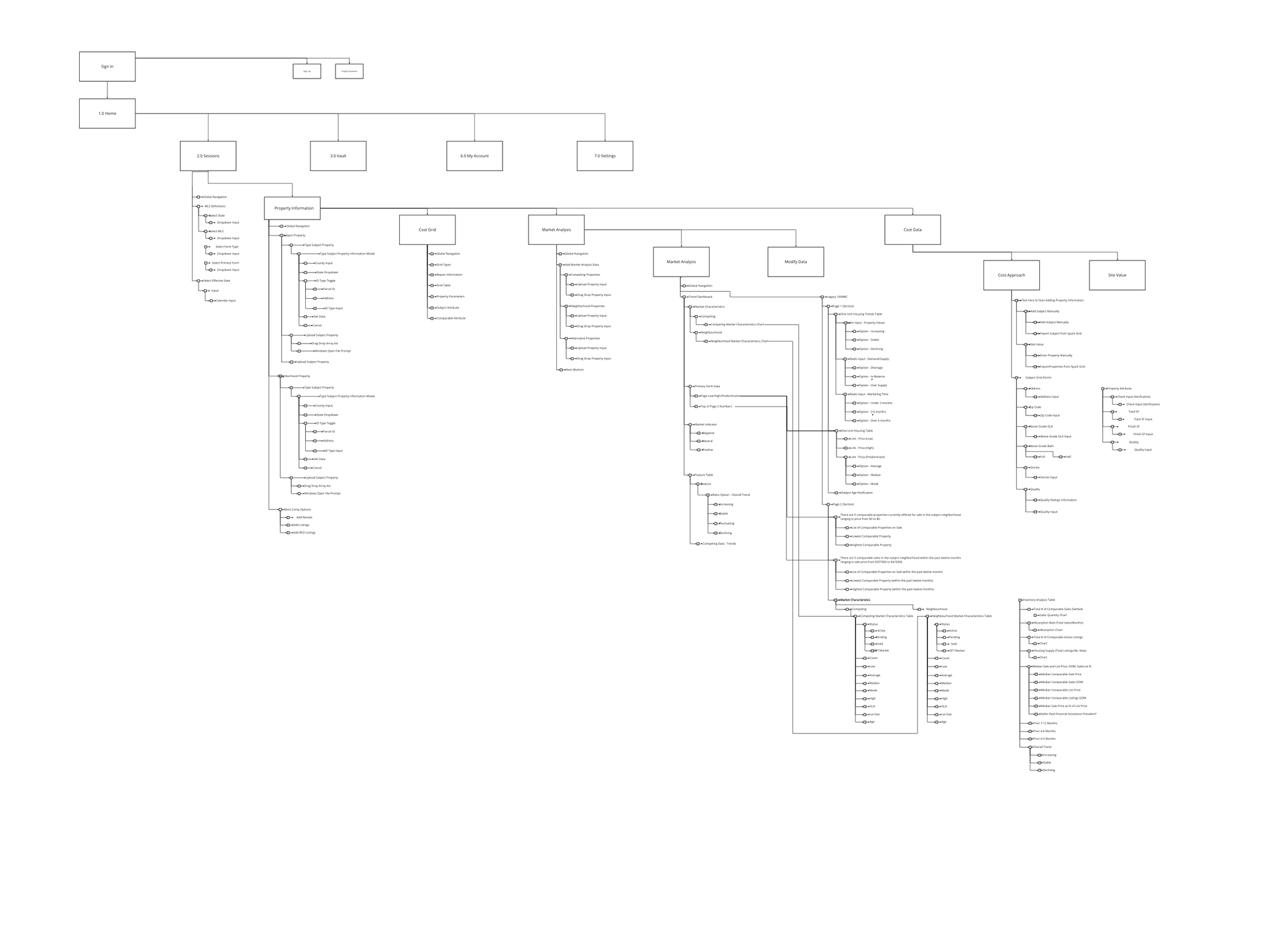
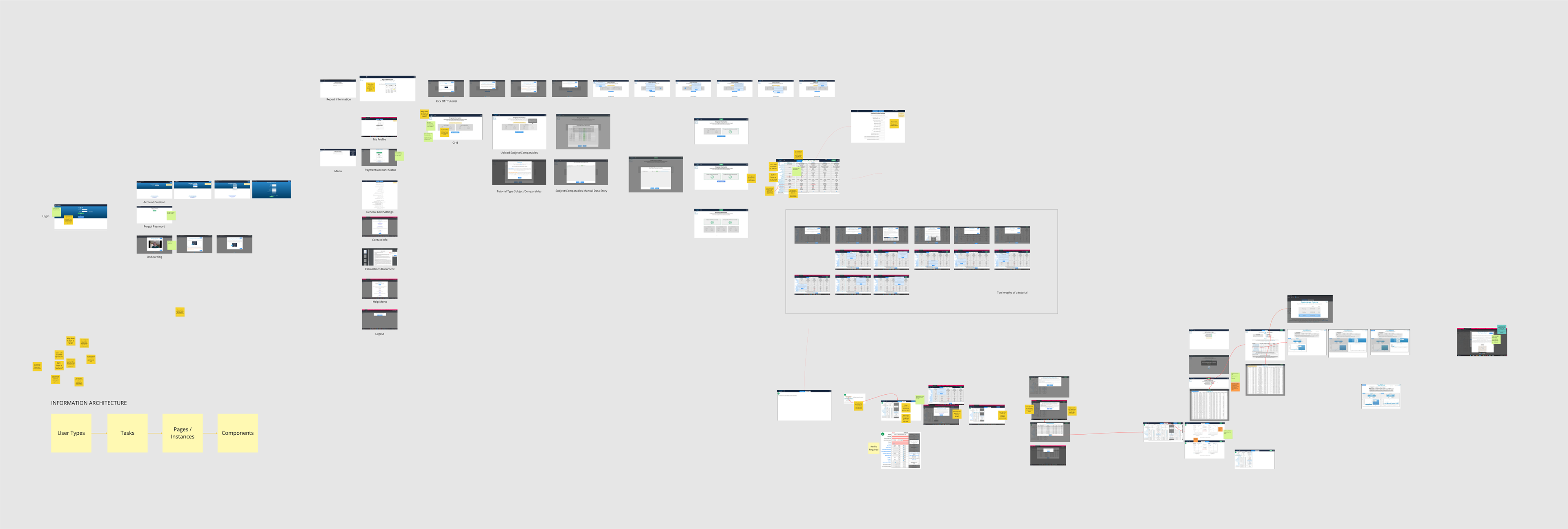
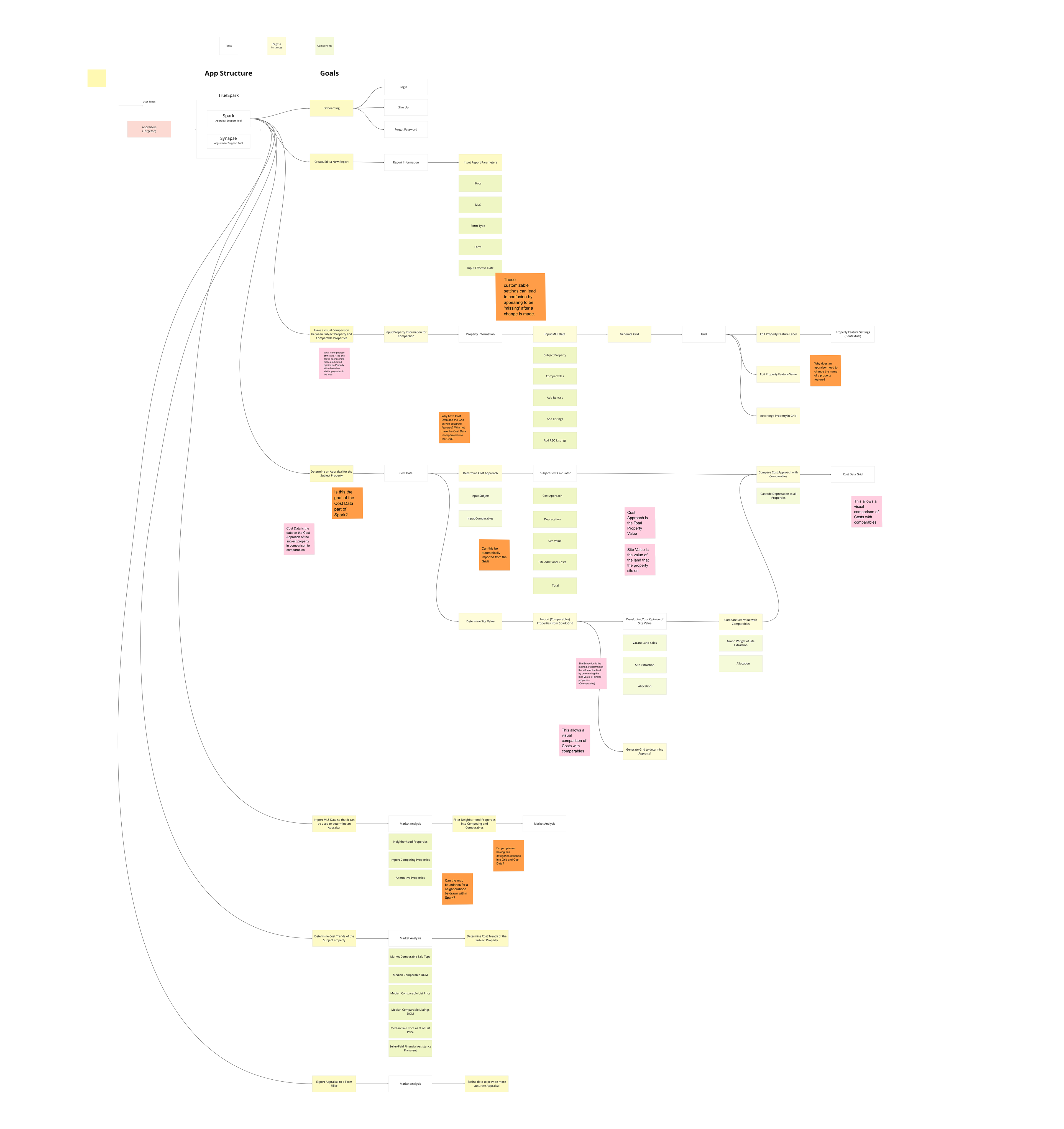
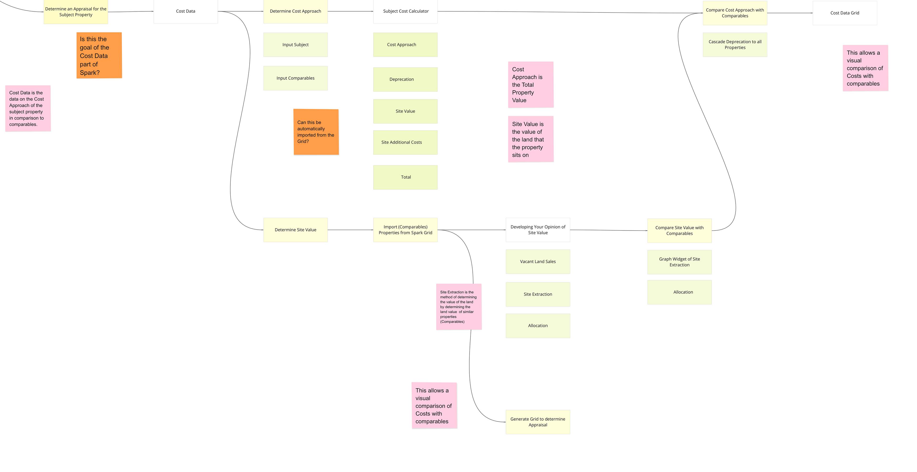
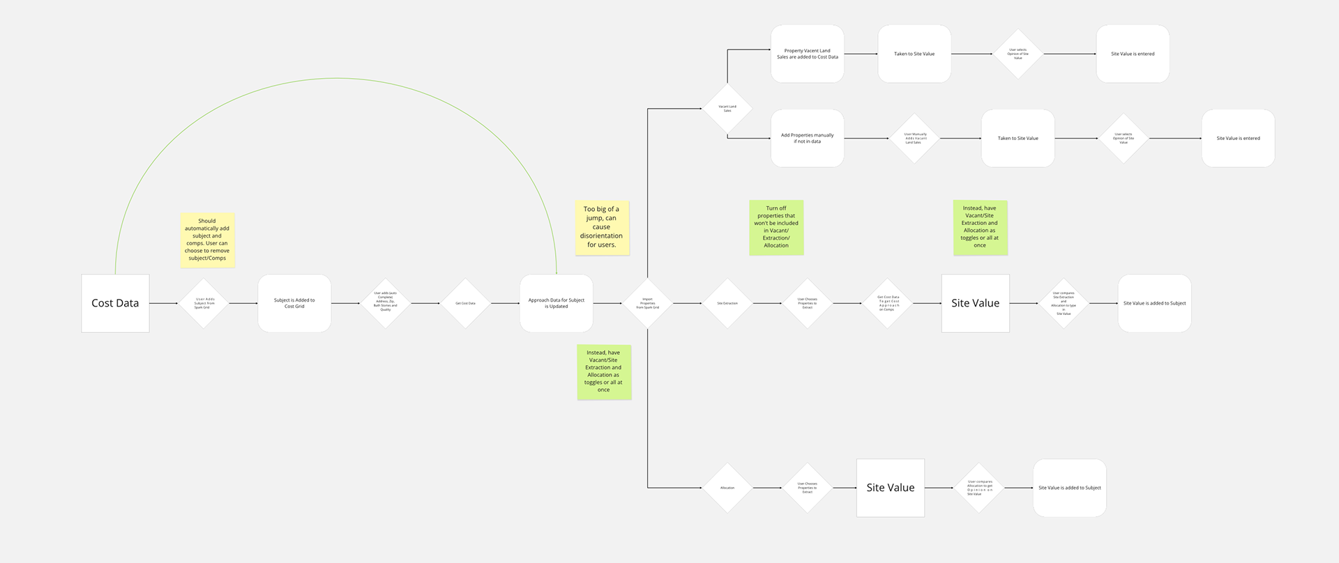
Full Function Map of the current Nova SaaS.
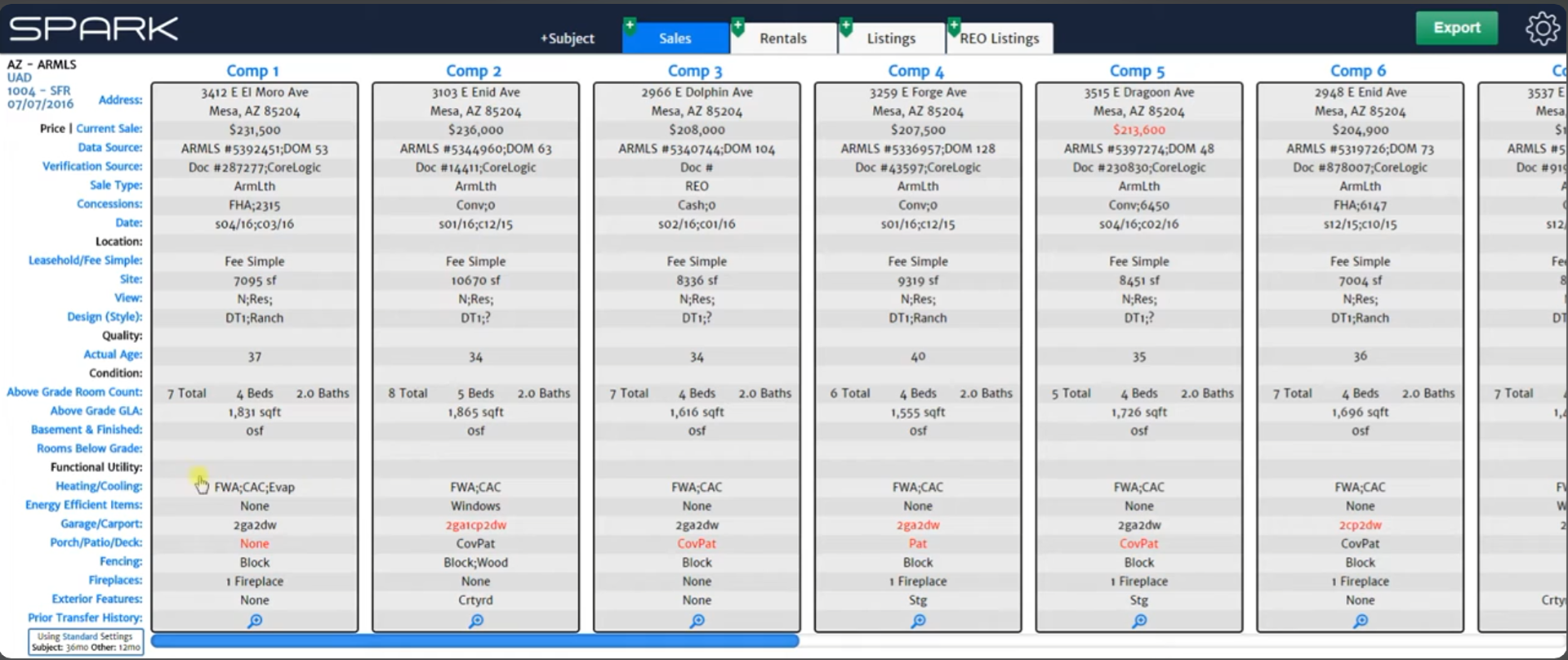
In the legacy Spark grid, blue text served multiple purposes simultaneously. To indicate the comp columns are draggable, clickable feature labels, and general styling. Clicking a feature label mid-analysis could navigate away from the grid entirely, or cause that row to disappear after a settings change (a bug).

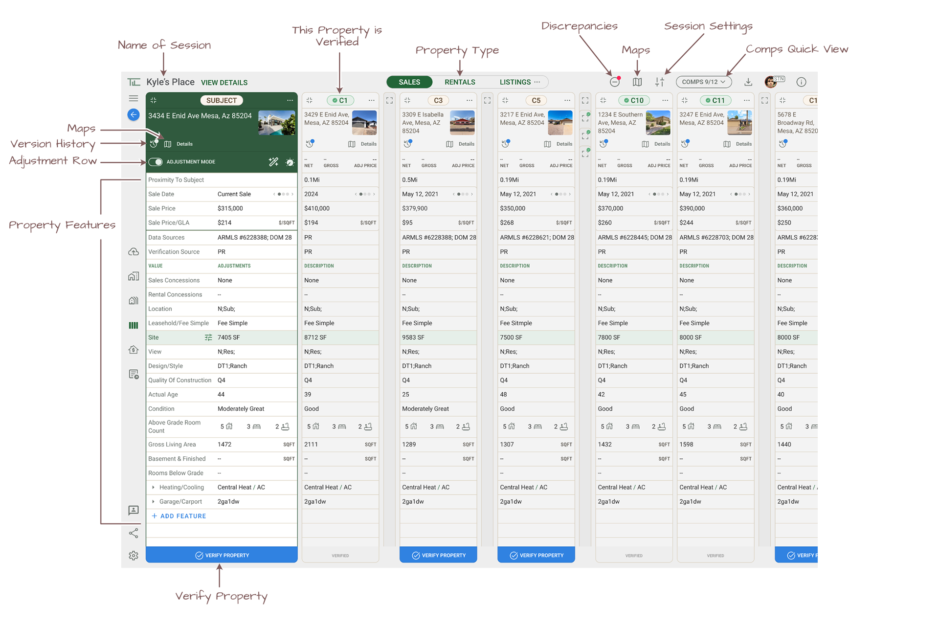
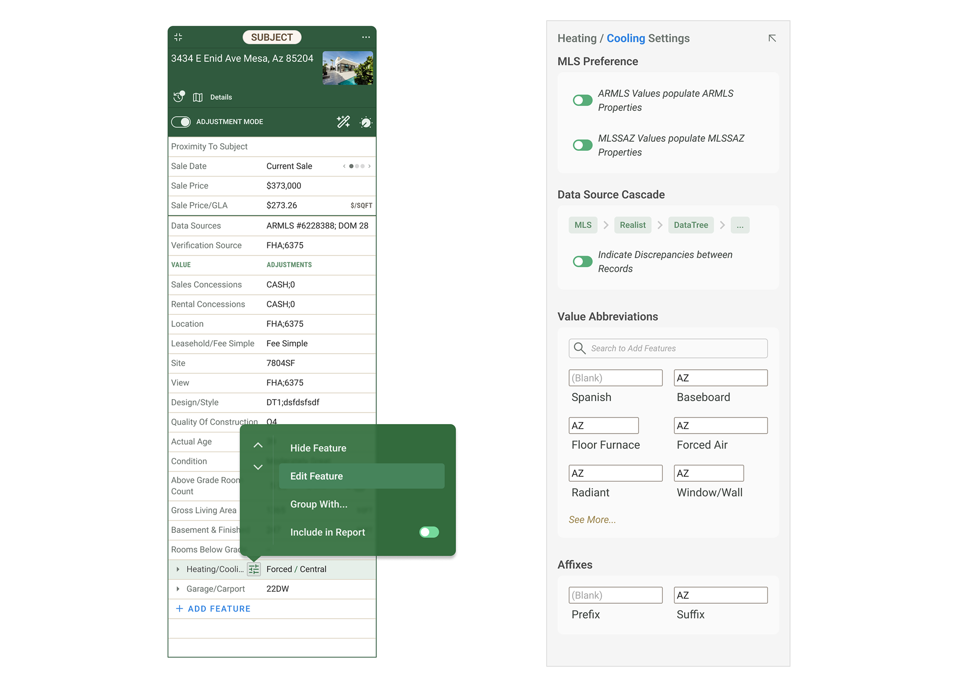
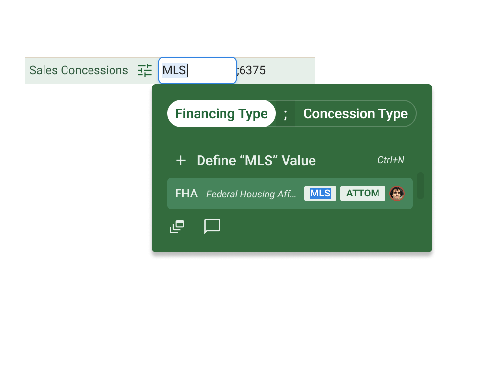
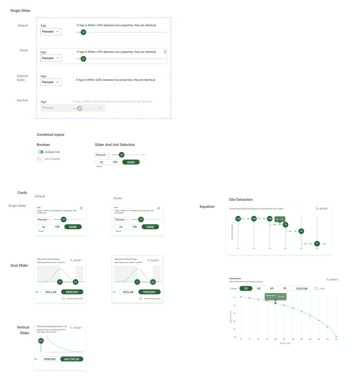
The data entry popover lets appraisers search for values from connected databases such as MLS sources, industry-defined standards, or entries previously logged by teammates. From the same popover, they can propagate a value across all columns or flag the cell with a contextual message to a teammate.
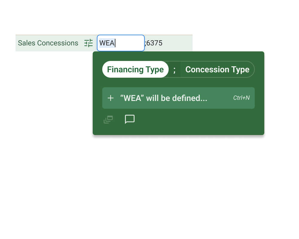
Adding new parameters works differently. Because this happens during active appraisal work, it's handled through the data entry flow rather than through settings. On-the-fly creation is treated as part of building the report. The distinction between "setup" and "in-session work" is deliberate and consistent throughout the grid.
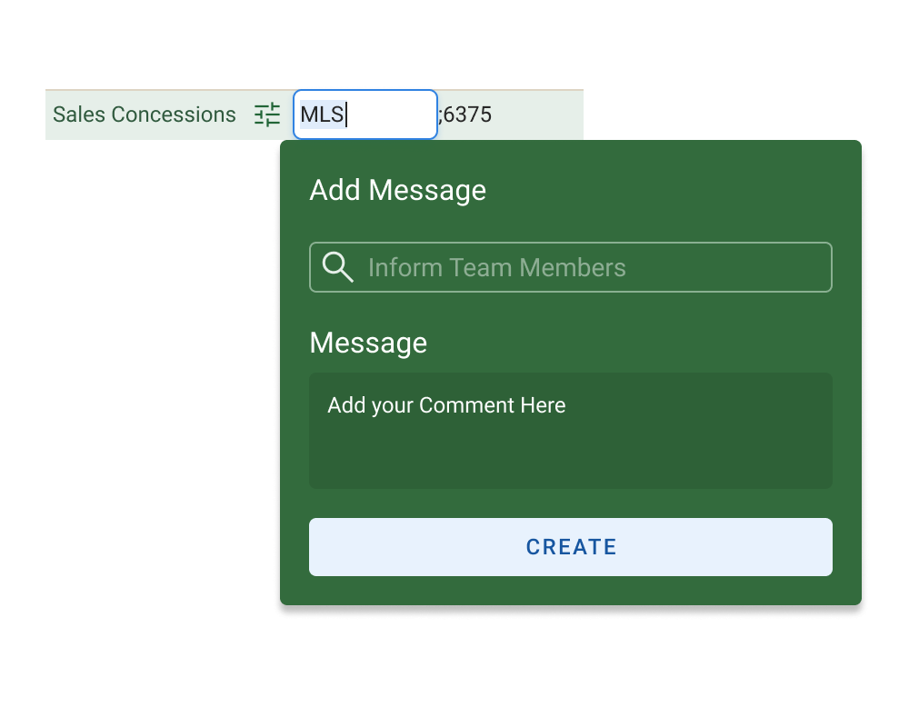
The message button lets appraisers flag a cell for a teammate's review without leaving the grid.
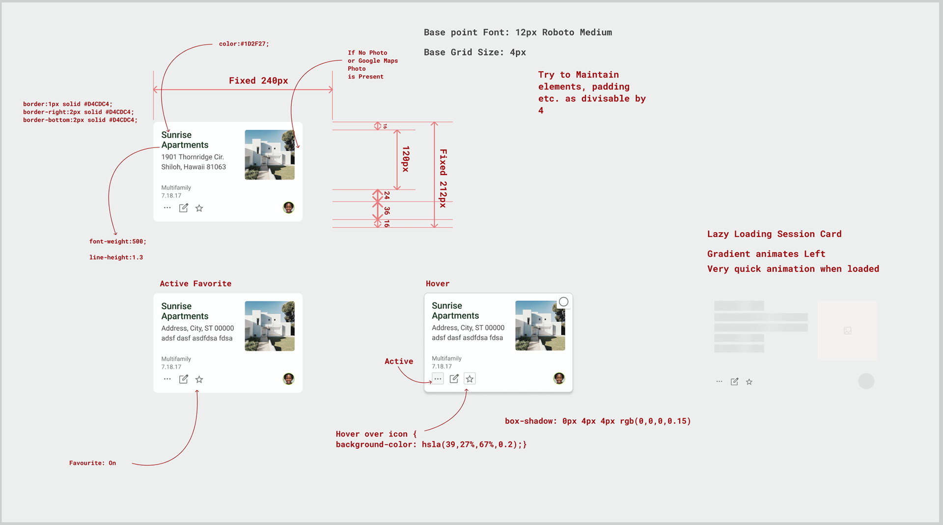
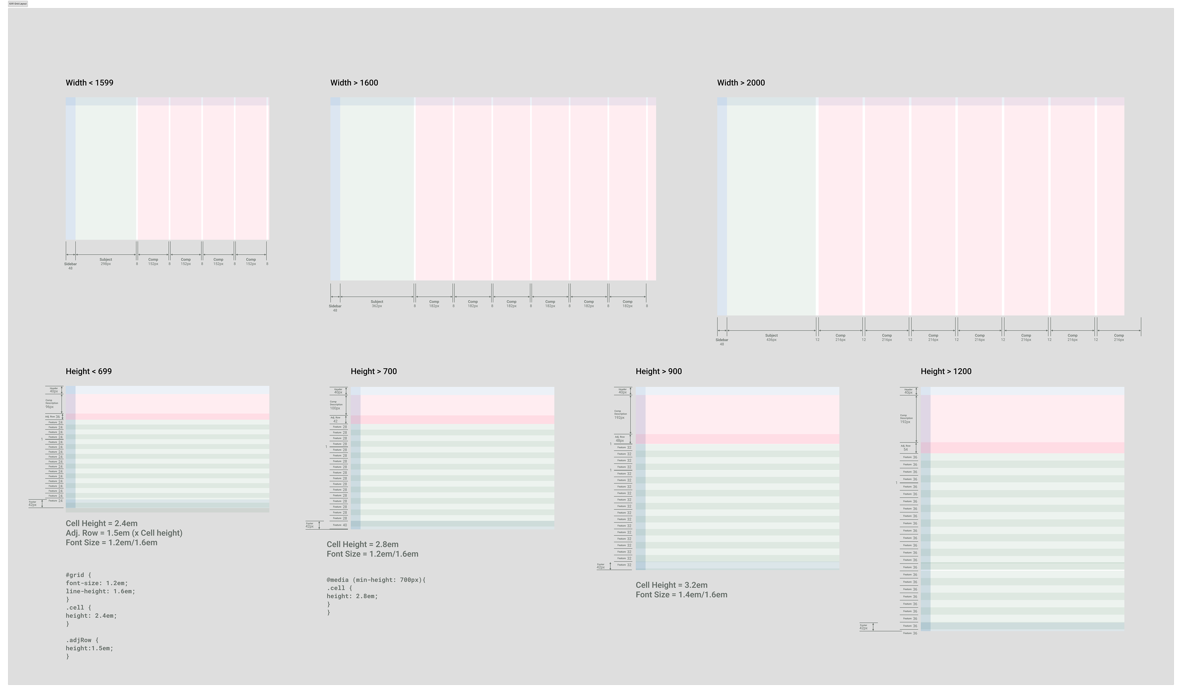
By resetting the root em value at each breakpoint, every element scales proportionally from a single value: cell height, font size, and padding move together. The spec defines four vertical breakpoints, each incrementing cell height and font size so the grid never loses its proportional rhythm. For appraisers in their 60s, 70s, and 80s on aging hardware, legibility scales to the screen available without the development team maintaining separate layout rules for every configuration. Browser zoom accessibility is handled correctly as a byproduct.
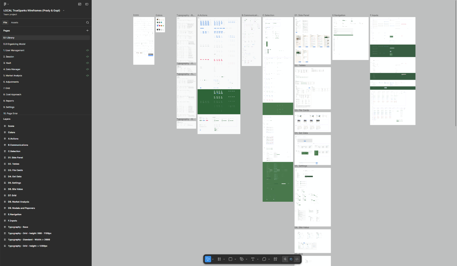
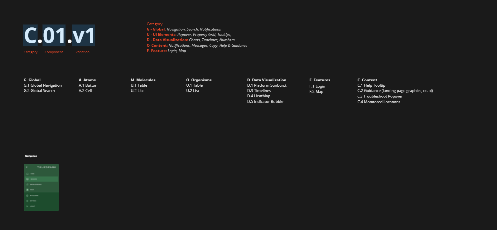
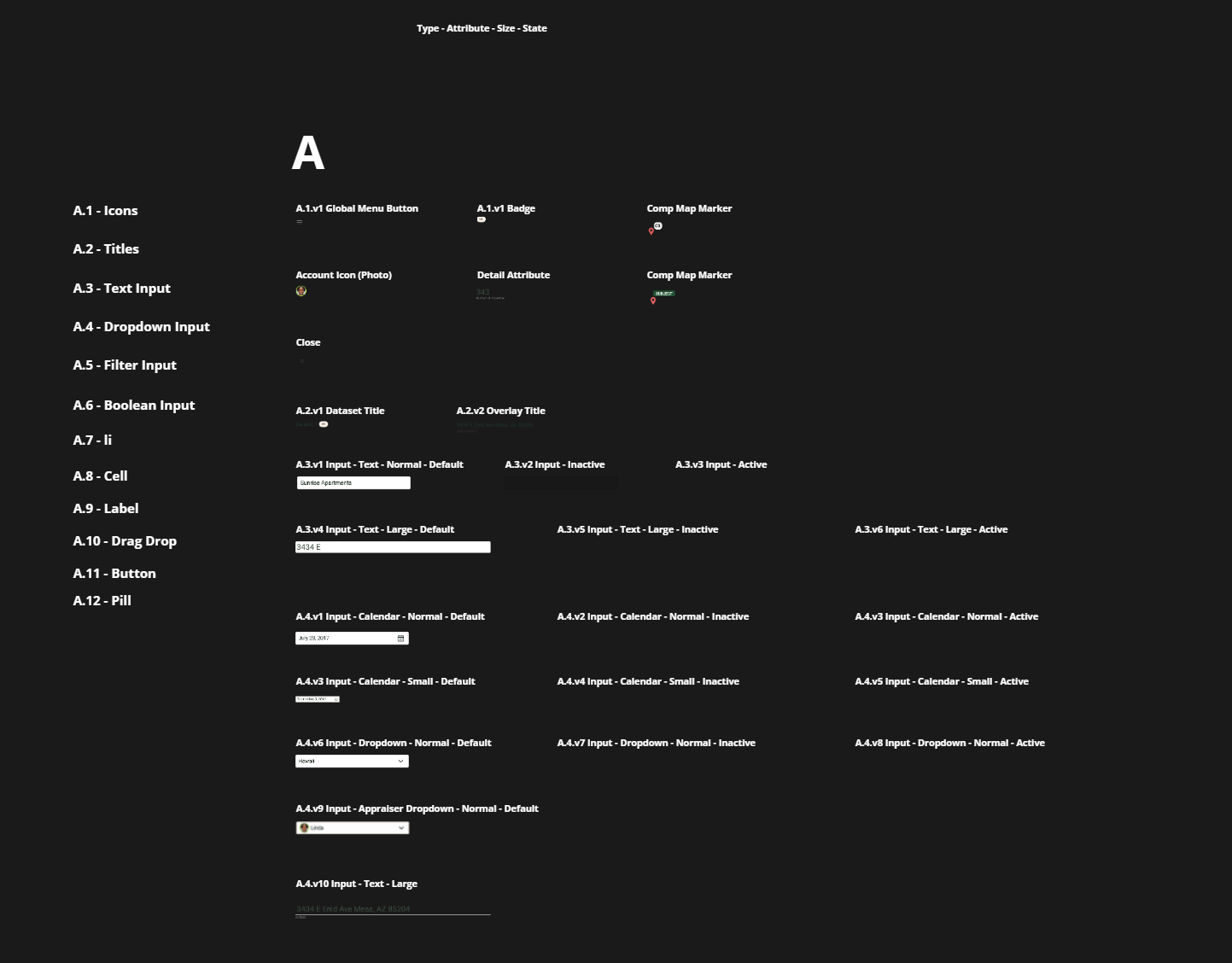
Client/Developer facing Figma File, on the Design System page. The pages are organized to allow for easy recall of components.
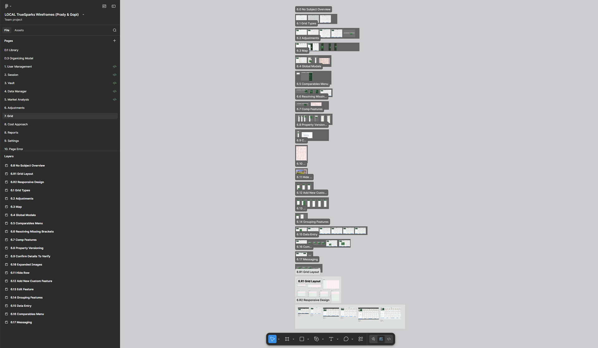
Figma page of the Grid section. On the left, the pages are organized and labelled by major feature of the app, on the right, are pages and components listed by user stories and functions. The pages are designed to ensure developers and stakeholders can understand how features work and be able to quickly find the screen.