
Impact
Turned a long, error‑prone inspection form into a guided, auto‑saving workflow that helps inspectors complete on‑site reports more reliably and with fewer missed fields, even under tight release constraints.
Client
TrueFootage Inc.
Team
Pradyot Rai - Lead Designer
Gopi Thambirajah - Senior UX Designer
Overview
TrueInspect is an internal tool used by property inspectors to capture detailed on‑site data for complex, multi‑structure properties. The original tablet‑only app was dense, brittle, and difficult to use in the field. The initial ask for this project was narrowly scoped to “make it work on mobile” without changing the back-end infrastructure. Working as the senior UX designer in a small, fast‑paced team, I pushed for a focused heuristic evaluation and a set of targeted improvements that would meaningfully reduce errors and frustration while still respecting the existing data model and release constraints. The work below shows how we used UX fundamentals to quickly reshape a legacy tool in an environment where design had to prove its value under pressure.
Goals
The formal brief was narrow:
• Add portrait support to the existing tablet app.
• Design a mobile version that stayed visually close to the current design so it could ship quickly.
• Explore a “quicklist” control to handle dropdowns with 50+ options, based on a pattern from a competitor (“Total for mobile”).
As we examined the current experience, it was clear that simply porting the UI would preserve bigger problems: vague progress, heavy manual saving, fragile navigation, and a complex tree structure that didn’t scale. Rather than just implementing the quicklist, we pushed back and proposed a short, heuristic‑driven pass to de‑risk the inspection workflow while staying inside the original constraints. That advocacy created space to improve the app as a whole, not just the specific controls we were asked about.
Heuristic Evaluation
To rapidly identify the most critical issues, I ran a heuristic evaluation based on Nielsen Norman Group’s usability heuristics. Instead of treating them as a checklist, we used them to:
• frame problems in shared language, and
• prioritize fixes that would have the highest impact on inspectors under field conditions.
I then clustered findings into four themes:
A. De-risking Data Loss and Critical Mistakes
B. Making a Long Form Navigable and Scannable
C. Clarifying Concepts and Standards
D. Reducing recall and handling repetition
Below are selected issues and fixes from each theme.
A. De-risking Data Loss and Critical Mistakes
Inspectors were doing long, non‑linear work on site, but the app relied on manual saves, hidden requirements, and destructive actions with no confirmation.
Issue 1. Manually Saves Risks Data Loss
Heuristic: Match Between System and Real World
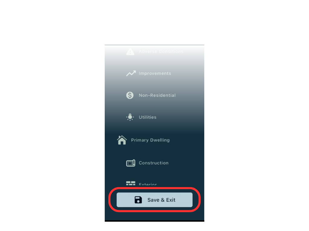
Saving an inspection required tapping a “Save and Close” button at the bottom of the navigation. This legacy pattern clashes with modern expectations of autosave. In a long on‑site flow, forgetting to tap it could mean losing hours of work and having to revisit the property. At the same time, there was no way to leave an inspection without saving, which encouraged the creation of empty inspections and cluttered the list. Both patterns increased frustration and operational risk.
Fix.
We shifted saving from a conscious “Save and Close” action to autosave on field blur. Data is persisted as inspectors move between inputs, reducing cognitive load and aligning with current expectations. The exit action was replaced with a standard back button in the header, matching iOS conventions and giving users a more forgiving sense of “going back” rather than “exiting.” This combination reduced the risk of catastrophic loss while avoiding unnecessary empty inspections.
Issue 2. Photos can be Deleted without Confirmation
Heuristic: Error Prevention
Tapping the delete icon on a photo immediately removed it with no confirmation. Given the importance of photographic evidence in inspections, accidental taps could silently erase critical data.
Fix.
We added a confirmation prompt before deletion. This small step respects the cost of losing evidence and aligns the interaction with user expectations for destructive actions.
Issue 3. Same-Type Rooms Make It Easy to Edit the Wrong Data
Heuristic: Error prevention; Recognition rather than recall
Within a structure’s “Finished Space,” inspectors often manage multiple rooms of the same type (e.g., several bedrooms or kitchens). In the original form, these rooms were listed in sequence with similar labels. During review, it was easy to confuse one room for another and edit the wrong data, especially in larger properties with repeated patterns.
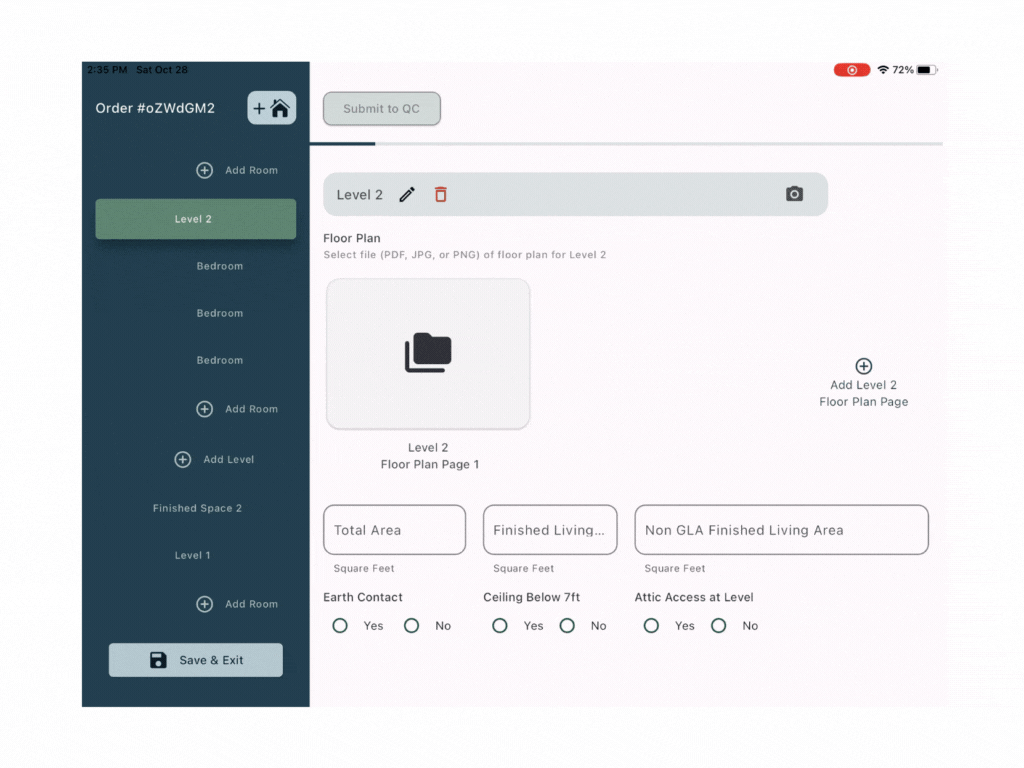
Fix.
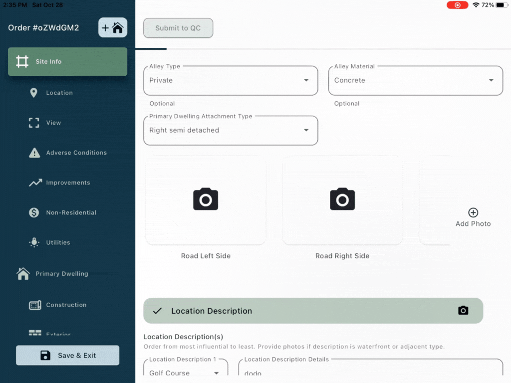
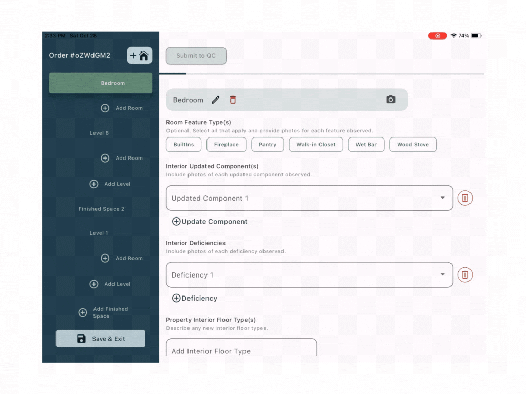
We moved each finished space out of the giant form into its own page, and did the same for each level of the structure. This page‑based architecture:
• makes it clear which structure and level the inspector is working in,
• reduces the risk of editing the wrong room,
• shortens the visible form, and
• improves readability and navigation.
The structure itself is mapped visually so inspectors can construct and rearrange levels (roofs, standard spaces, basements) via drag‑and‑drop; dropping a level below the ground line turns it into a basement. When a level is selected, the UI slides to a level page; when a room is selected, it slides to that room’s data. Repeated attributes (like flooring) can be auto‑filled into new rooms, reducing repetitive data entry while keeping context clear.
B. Making a Long Form Navigable
The inspection form is long and filled non‑linearly. Inspectors move through the property, jumping between sections; without clear feedback and navigation, it’s easy to miss required data.
Issue 4. “In Progress” is too vague
Heuristic: Visibility of System Status
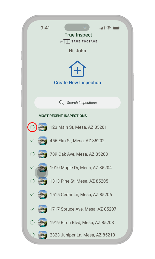
For the home page displayed are inspection lists, where each incomplete form shows “In Progress”, but not how much was left or what remained. For long forms, this vague state creates anxiety rather than confidence: inspectors couldn’t tell whether they were minutes or hours away from completion. 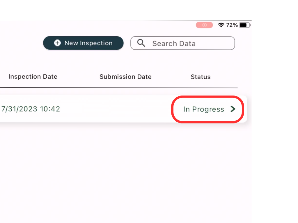
Fix:
We replaced the generic text label with a more quantifiable progress indicator and more recognizable visual affordances for incomplete items. The design reduces the list's table‑like appearance one that works better on mobile while still conveying how far along each inspection is. We also surfaced an image of the site exterior alongside the listing, supporting recognition. Inspectors are often more likely to remember a property by its photo than by address alone.
Issue 5. Hard to See What’s Done and What’s Missing Inside the Form
Heuristic: Visibility of System Status; Recognition rather than recall
Inside an inspection, the form was long and often completed out of order. Inspectors had to scroll carefully to find checkmarks at subsection headings to see what was done. The header’s progress bar showed how much was completed overall, but not where missing data lived. This made it easy to get lost and potentially leave a site with gaps.
Fix.
At first, changing the simple inspection progression bar was considered. Previously, it showed the amount of the form completed by filling the bar green from left to right. We looked at having this bar map where form inputs have been filled. However, this did not work as it made this pattern harder to understand and it was hard for the user to go directly to empty fields. So, we kept it as is.
We kept the simple progression bar in the header (it was understandable and familiar), but used the scrollbar itself as a map of the form. When users scroll with enough speed, a sticky scroll menu appears, aligned to the scrollbar. It shows sections and their completion states, and lets inspectors tap a subsection or drag the thumb to jump directly to incomplete areas. This pattern is common among long photo galleries. This keeps a high‑level overview within a single viewport and makes a very tall form feel more manageable.
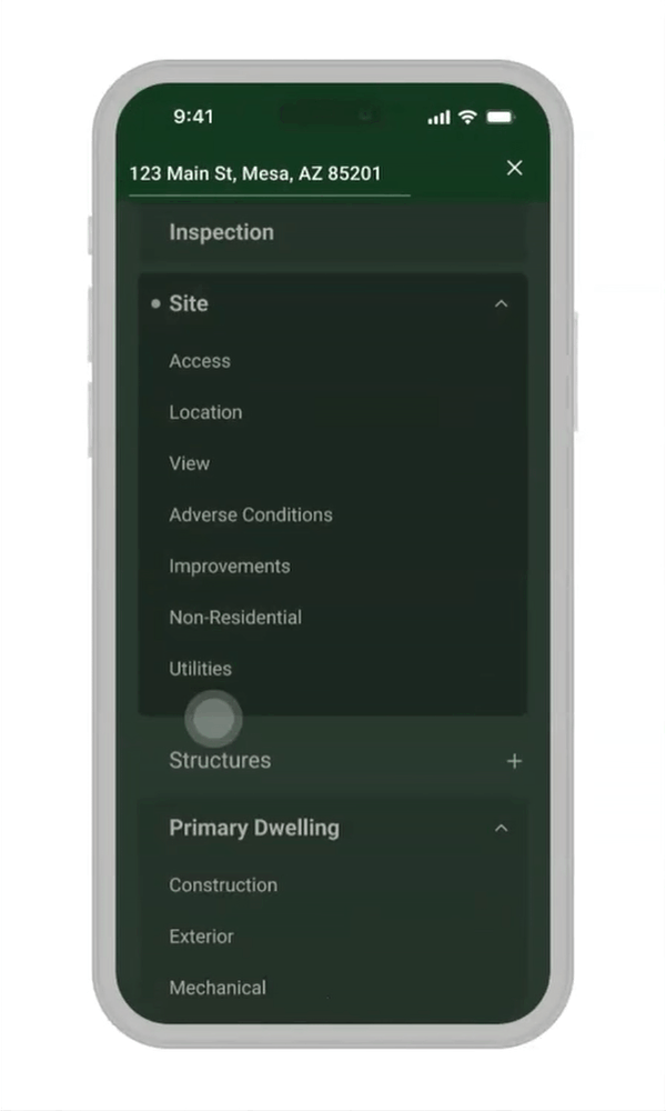
Issue 6. Tree Navigation Becomes Unmanageable as Data Grows
Heuristic: User Control and Freedom; ; Aesthetic and Minimalist Design (implicitly)
As inspectors added structures, levels, and rooms, the navigation tree grew vertically and became hard to scan. Anchor links were added for created items, but the list itself could become so long that it defeated its purpose. Deeply nested tree navigation is particularly problematic on mobile and doesn’t scale for multiple nesting levels.
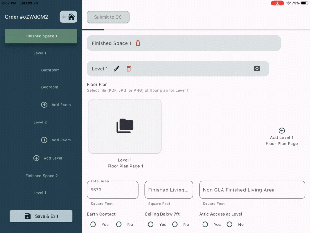
Fix
We replaced the tree with a simplified accordion:
• Nested elements are collapsed by default and revealed via chevrons on parent items.
• When inspectors navigate outside a section, the accordion auto‑closes to keep the list compact.
• Reduced indentation and flatter hierarchy make scanning much easier.
Deeply nested elements no longer appear as separate items in the main nav; they live on dedicated pages (as described in Issue 10), keeping the navigation short and focused while still giving inspectors access to detailed structure when needed.
C. Reducing Confusion in Concepts
Some core concepts, like structures, addresses, and submission states, were presented inconsistently, forcing inspectors to adapt to the UI instead of the other way around.
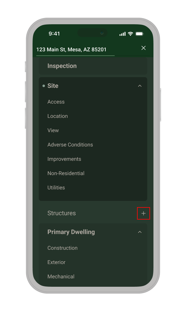
Issue 7: "New Structure" Icon does not match Mental Model
Heuristic: Match Between System and Real World
Sites can have multiple structures (barns, detached garages, etc.) belonging to a single inspection. The “plus home” icon to add a structure sat in a global‑looking position, away from the structures list, and used a generic icon. Its placement and labeling made it easy to confuse with “create new inspection.”
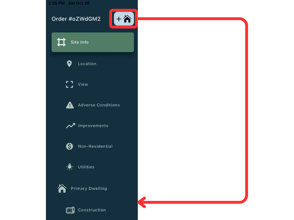
Fix.
We simplified navigation and iconography, then repositioned the add‑structure action directly next to the “Structures” section in the nav. The icon was reduced to a clearer “+” within that context, making it obvious that users are adding a structure to the existing inspection, not starting an entirely new inspection.
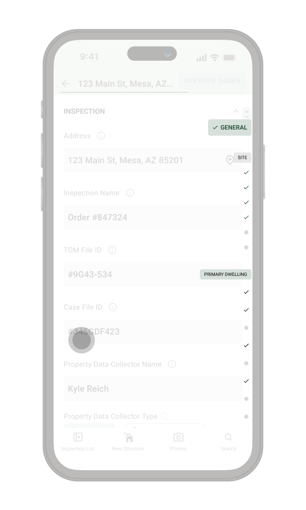
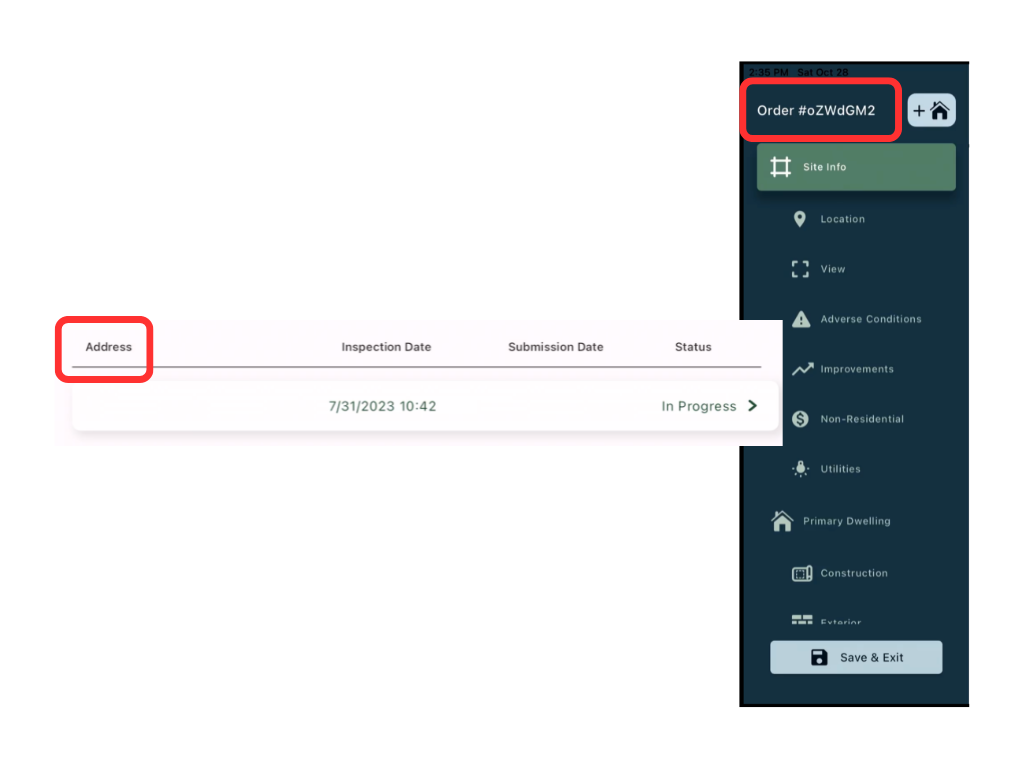
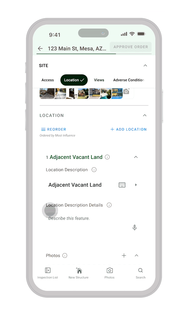
Issue 8: Address vs. Order Number Mismatch
Heuristic: Consistency and Standards
On the inspection list, items were labelled by address. Inside the inspection, the main title switched to order number. While inspectors can adapt over time, this mismatch makes scanning and reconciliation harder than necessary; especially when dealing with many inspections.
Fix.
We chose a single, user‑centered primary identifier: address. Addresses are how inspectors naturally think about properties, so we used them consistently in both list and detail views, aligning the interface with their mental model.
Issue 9: Submission Button Appears Enabled When It Isn't
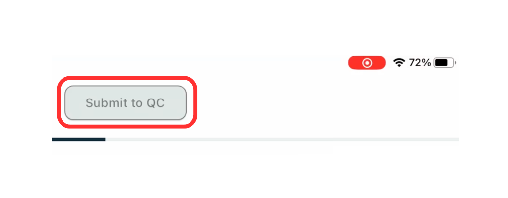
Heuristic: Consistency and Standards; Error Prevention
In each inspection form, inspectors complete applicable fields, then press “Submit to QC” to send the inspection to Quality Control. This is for verifying with the TF team before entering the form into MLS. The button appeared visually active even when required fields were missing, which sends the wrong signal about system state and encourages premature attempts to submit.
Fix.
We introduced a clear disabled state with lower contrast for the button when requirements aren’t yet met. The label was updated to “Approve order” to better reflect the action’s meaning. Together, these changes align the control’s appearance with its true state and reduce confusion at a critical step.
D. Reducing recall and handling repetition
The combination of repeated patterns (rooms, views, photos) and subtle UI signals forced inspectors to remember too much and made it easy to lose track of where they were.
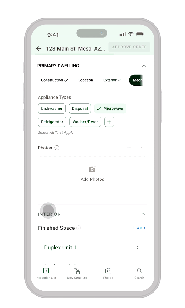
Issue 10: Required Photos Can Be Hidden and Hard to review
Heuristic: User Control and Freedom; Visibility of system status
Inspectors must attach photos for many site features. As they added more sub‑features (e.g., rooms), the app requests additional required photos. In the current design, photos appeared in horizontal carousels and were combined between sub-features at the bottom of major sections. If there were more photos than the row could show, some requirements could be off‑screen and effectively invisible. That made it easy to miss mandatory shots and fail the inspection.
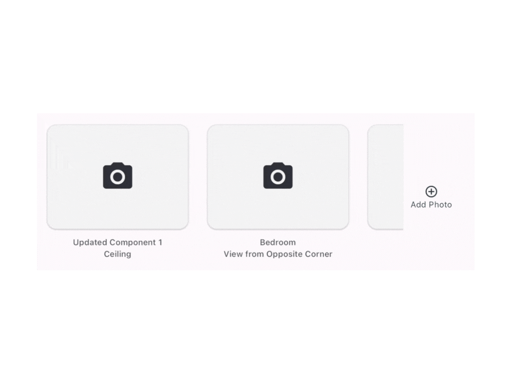
Fix
We made photos local and visible:
• Photos now sit directly within the sub‑section they belong to, not in a big combined strip at the bottom.
• Each photo row collapses visually, overlapping thumbnails and using a count badge when there are more images than fit.
• Tapping opens a gallery‑style view with titles and empty placeholders that clearly labels what is still required.
We also added a global Photos tab in the main navigation, giving inspectors a central place to review all photos across the inspection.
Issue 11: Repetition of Form Elements Can be Disorienting
Heuristic: Recognition versus Recall
When creating new rooms, the app automatically inserted new sections, causing both the navigation list and page content to shift. In a deeply nested structure, the simultaneous movement of multiple areas made it hard to maintain orientation.
Fix.
With the new architecture described in Issue 10 (using separate pages for levels and rooms) the UI no longer needs to insert large sections into a long scroll. Instead, inspectors move into and out of levels and rooms through a consistent page transition, removing the sudden, disorienting layout jumps.
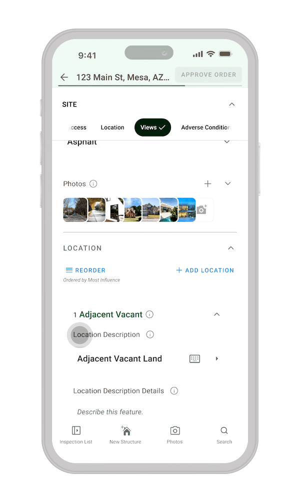
Issue 12: Priority Views Can't be Reordered
Heuristic: Recognition versus Recall; User control and freedom
Some parts of the inspection require data (like views) to be listed by priority. The requirement was mentioned only in small helper text, so it was easy to miss. If inspectors realized later that the order was wrong, the only way to correct it was to delete entries and re‑enter them in the right sequence. A workflow that relies heavily on memory is easy to get wrong after leaving the site.
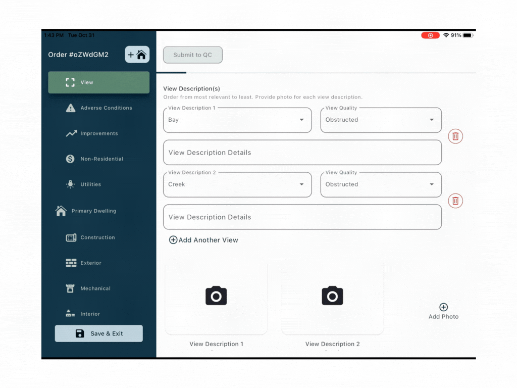
Fix.
We added a dedicated “Reorder” mode:
• A clear “Reorder” call‑to‑action appears at the top‑left of the section, paired with helper text explaining that views are ordered by relevance.
• Each list item is numbered, reinforcing that order matters.
• When inspectors enter reorder mode, field details collapse and a drag‑and‑drop interaction allows them to rearrange items easily.
This focuses the UI on the reordering task and reduces the need for recall when adjusting priority after the initial data entry.
Conclusion
TrueInspect started as a narrow request to “make the existing tablet app work on mobile,” but the real problem was a dense, brittle workflow that made a long, critical task feel risky and easy to break. By running a focused heuristic evaluation and pushing gently against the initial scope, we introduced autosave, clearer progress feedback, simpler navigation, and safer photo and room flows without changing the underlying data model or slowing release. The result is an inspection tool that still fits the team’s constraints, but is far more forgiving for inspectors doing demanding work in the field.