This is a project that combines my skills in Automotive design and applying them into a UI project. I have always been a fan of cars and the Lexus brand in particular as vehicles that epitomizes Japanese values in design. Minimalism defined in sharp edges and the embrace of nature. I have experience in many of their vehicles but something that truly let me down was their infotainment system.
Research
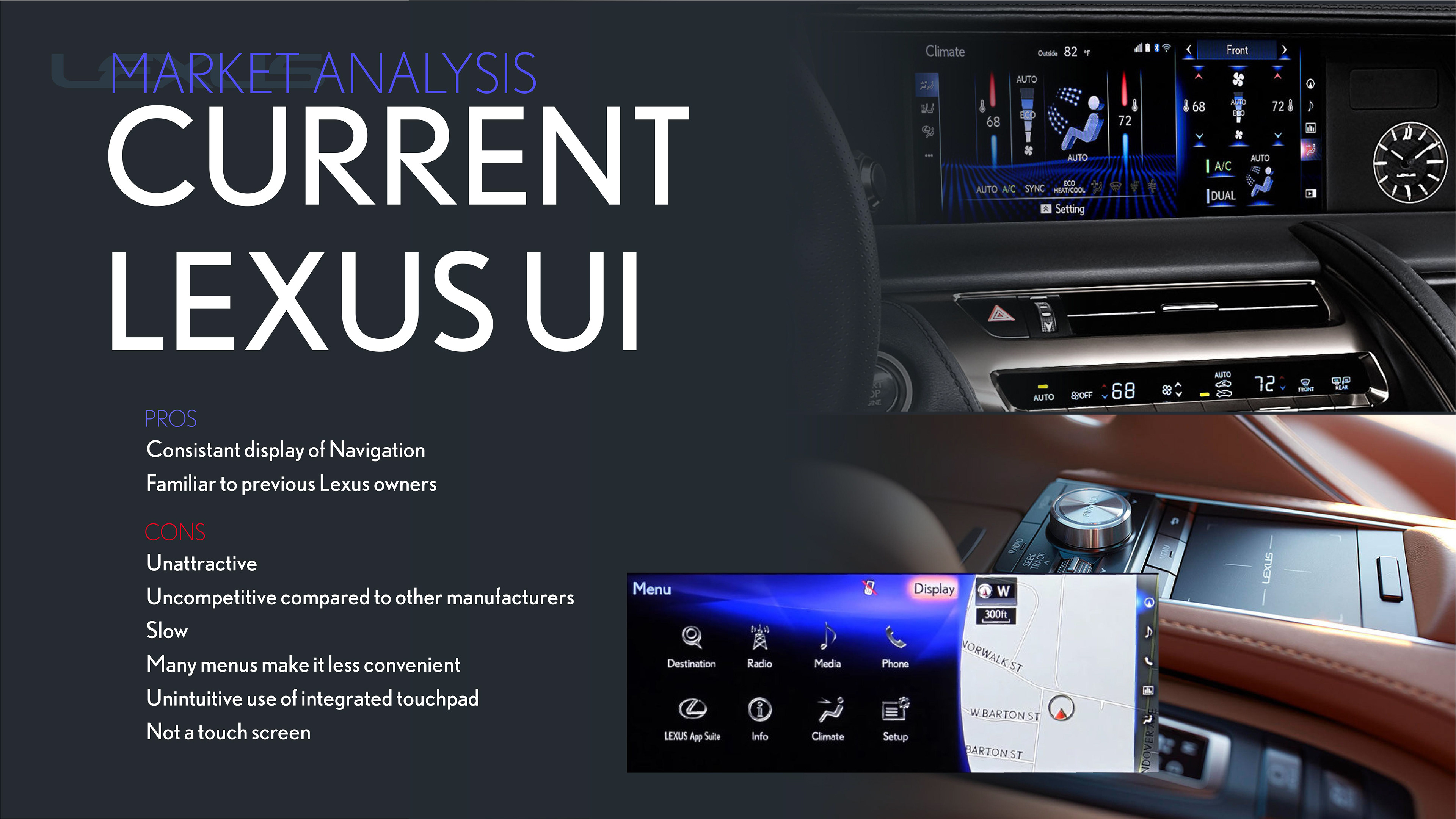
Current State
So how can we make a better infotainment system that fits within the Lexus brand? I took a look into the current state. I had some experience with Lexus vehicles and these are some observations I had.
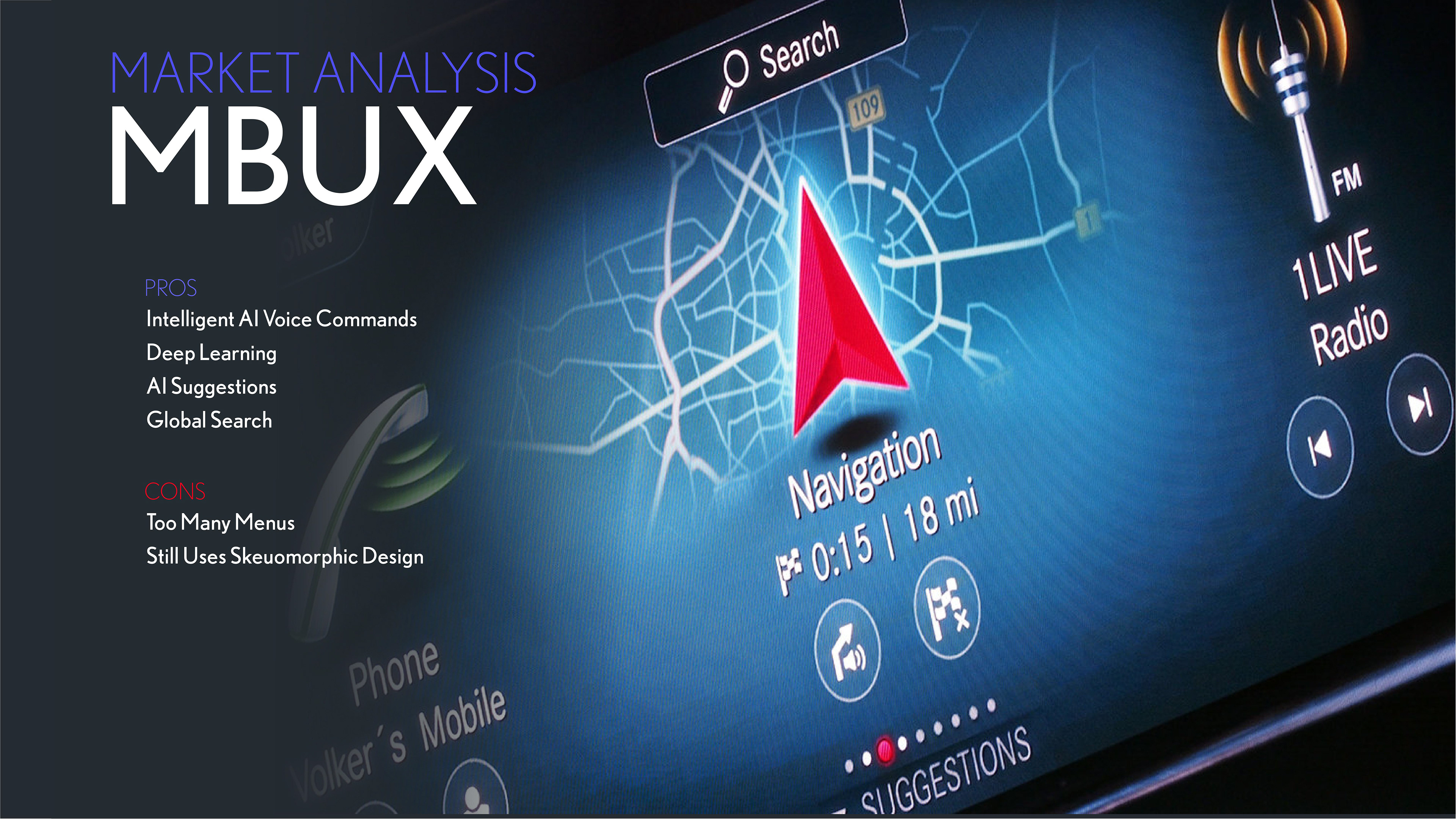
Competitor Analysis
The Mercedes-Benz UX is a new completely new system made by Mercedes-Benz that is the best in class for entertainment systems. Core features were the redundant commands, deep learning an a global search. The redundant commands allows passengers and driver to control the interface by voice, a knob or by touching the screen. This gives them the choice to use it for their preferences even when they might change for a given situation (i.e. touch screen when the car is parked but voice for when the car is in motion allowing it to be used without looking at the screen). The AI learns your preferences over time.
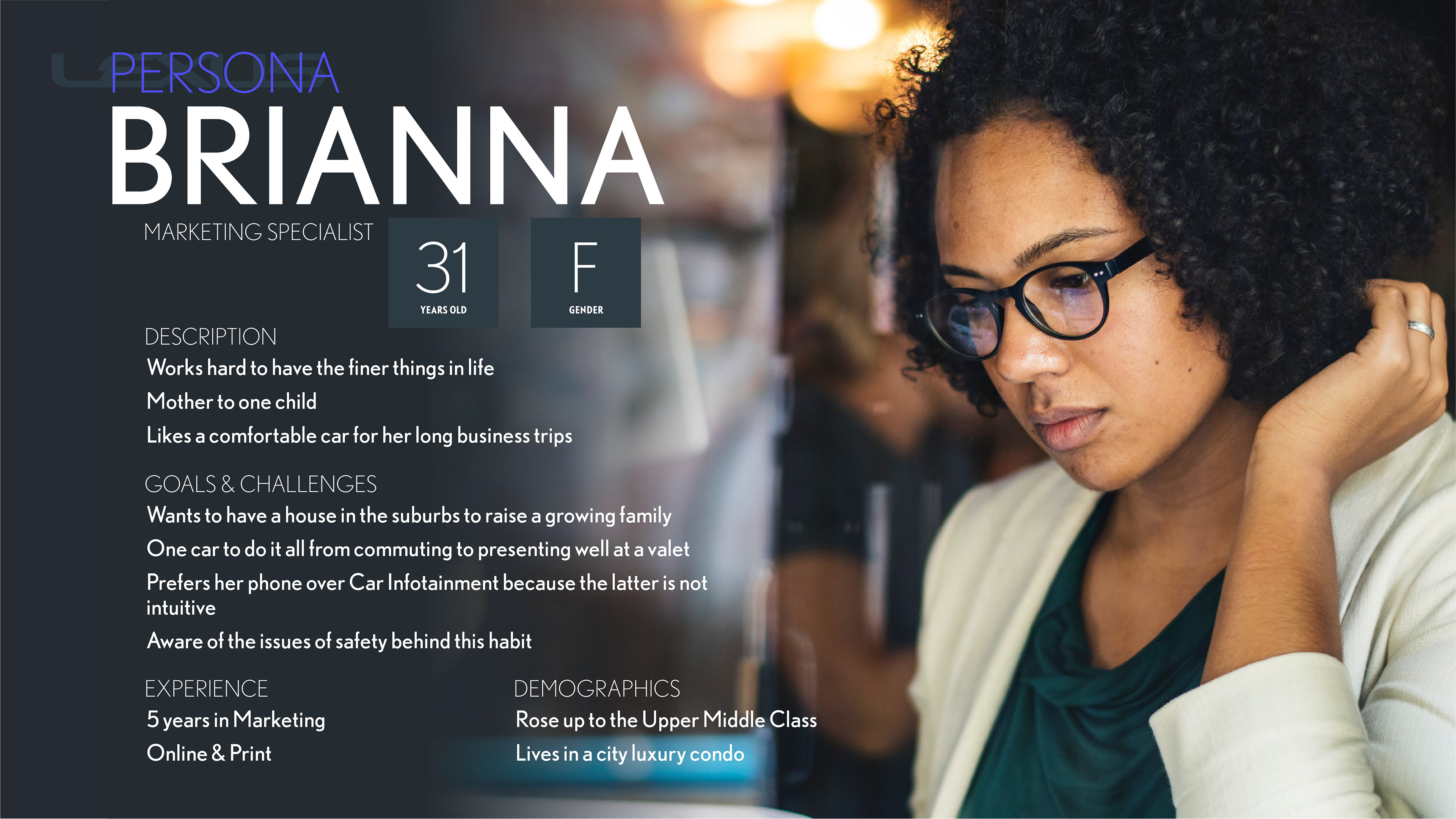
Persona
I quickly made a persona based of commercials Lexus aired in their marketing materials, like in print brochures they offered out during car shows I attended to their TV advertising. It's a strong clue as to their target market. Lexus vehicles tend to be a premium expensive product.
Wireframes
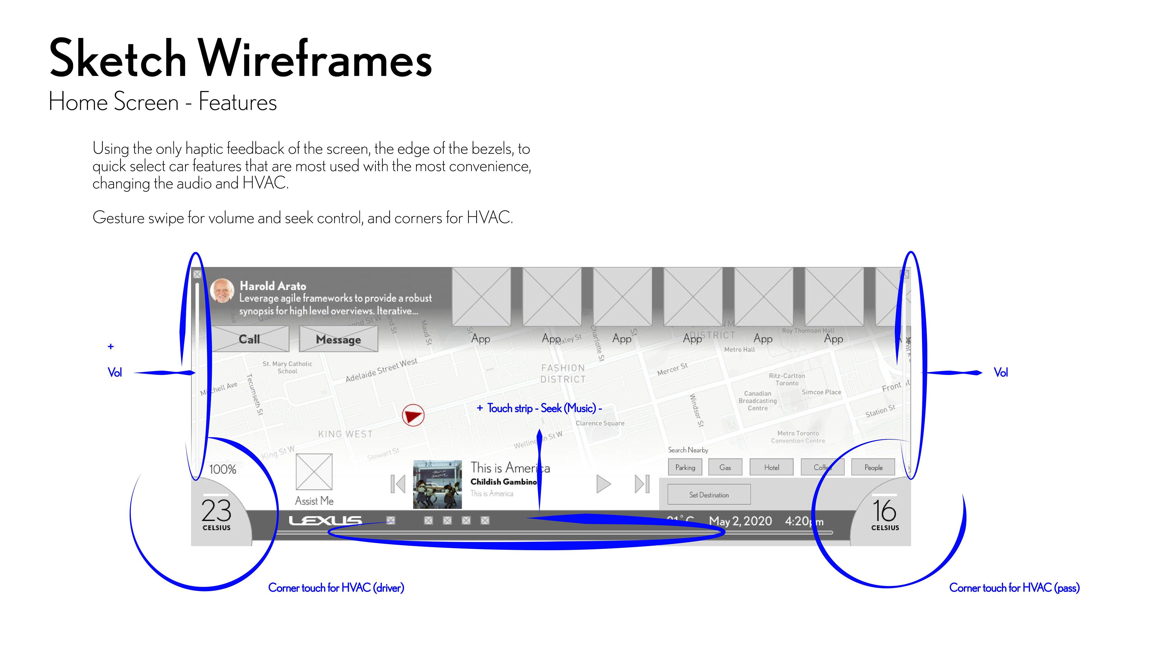
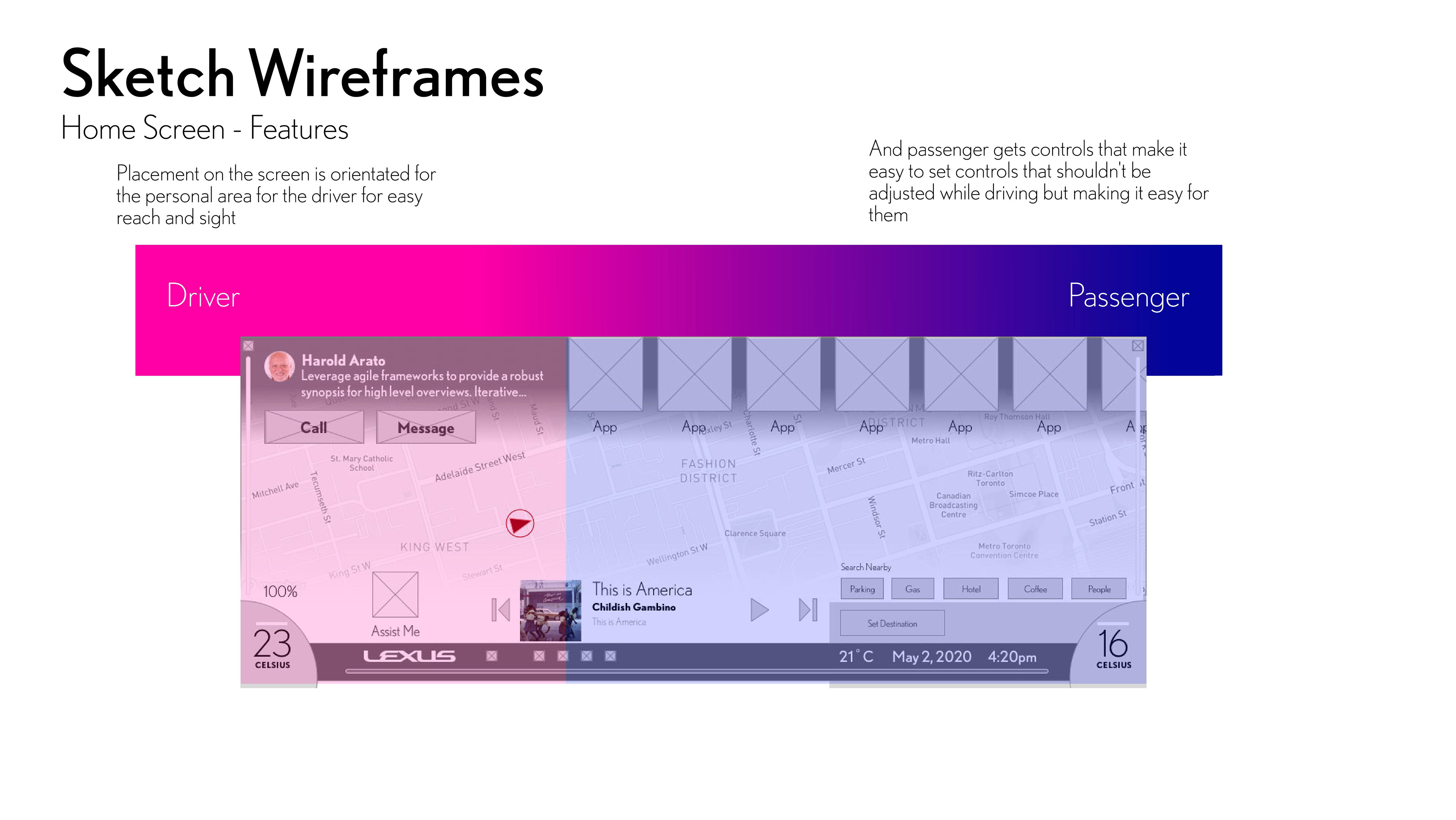
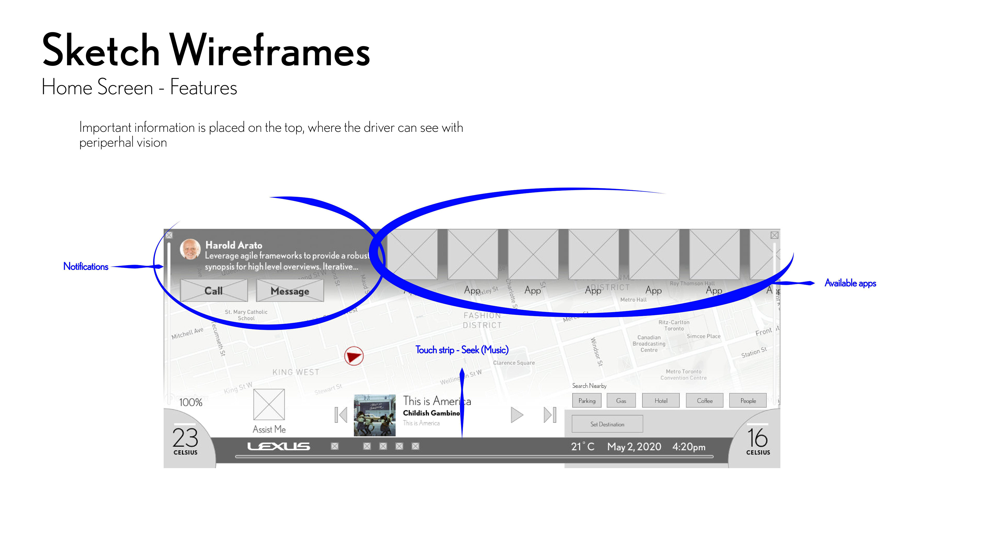
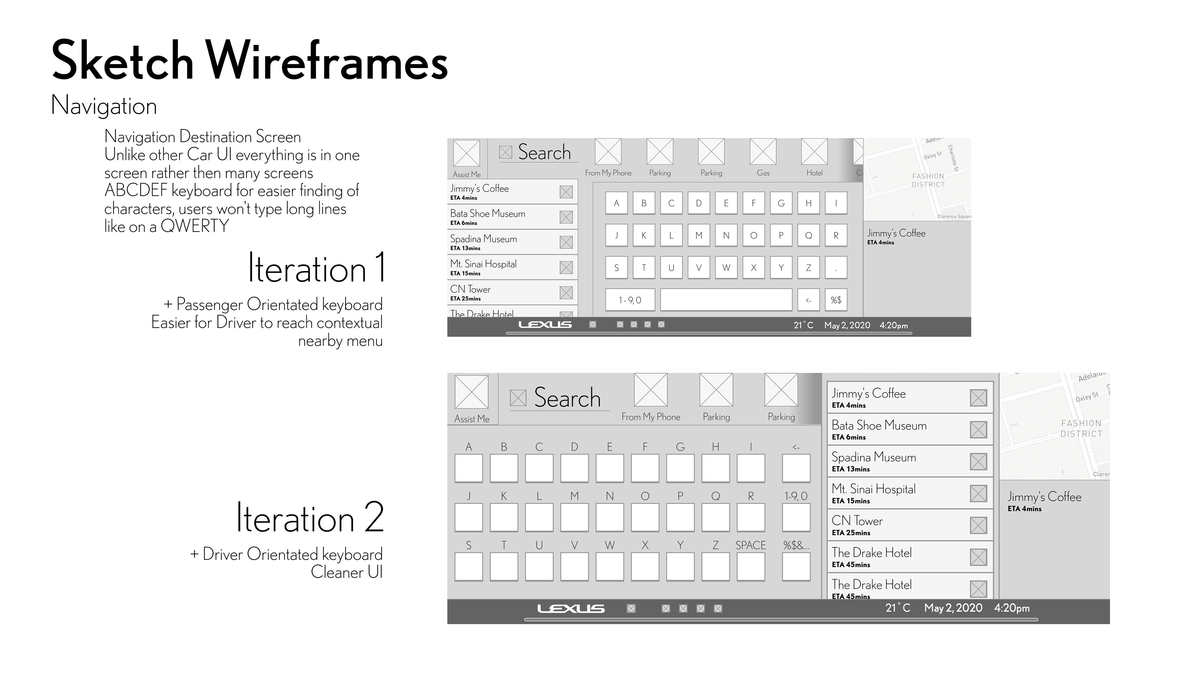
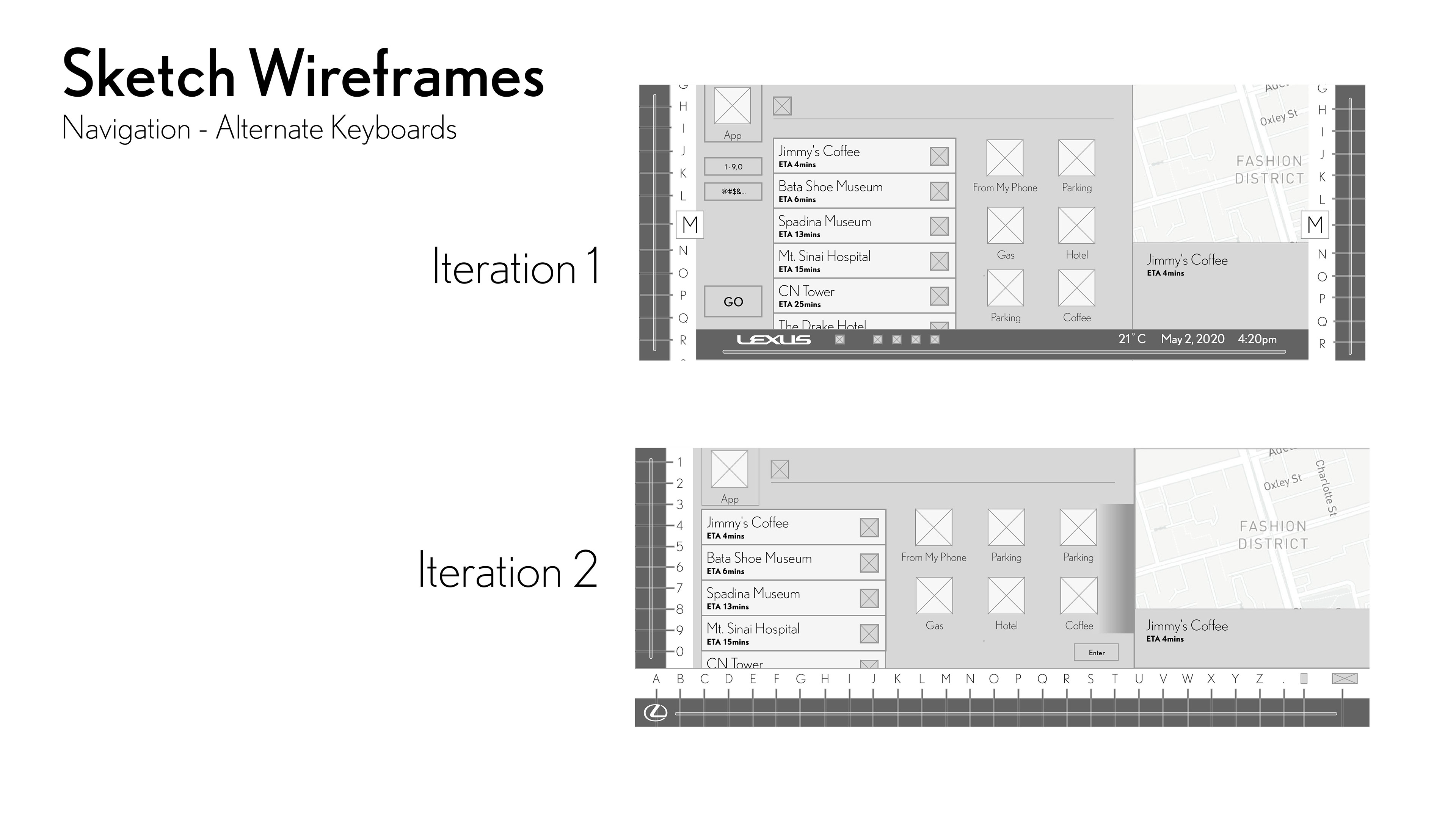
I got to building the wireframes. I wanted to build a screen that can function with only minimal or even no sight from the driver to use since the driver might be driving. To much focus as a requirement can compromise the safety of the vehicle. I looked at how a flat screen can provide haptic feedback. If someone can feel where a control would be, the need to see it no longer needs to be there. Also the most pertinent information should be at the top, so that it can be more easier to be glanced at.


Feedback
After completing these wireframes, I decided to get feedback from a UX designer much more experienced then I. His biggest criticism was that there were too much clutter within the screens and it needed to be simplified. Much of the criticism was caused by visual miscommunication where he mistaken temporary elements like sliders for the HVAC for permanent elements on screen. I just could not understand his sentiment however. I wanted for multiple functions to be at the users' fingertips. One of the annoyances of many infotainment screens is that they make the user go screen after screen in order to reach a function.
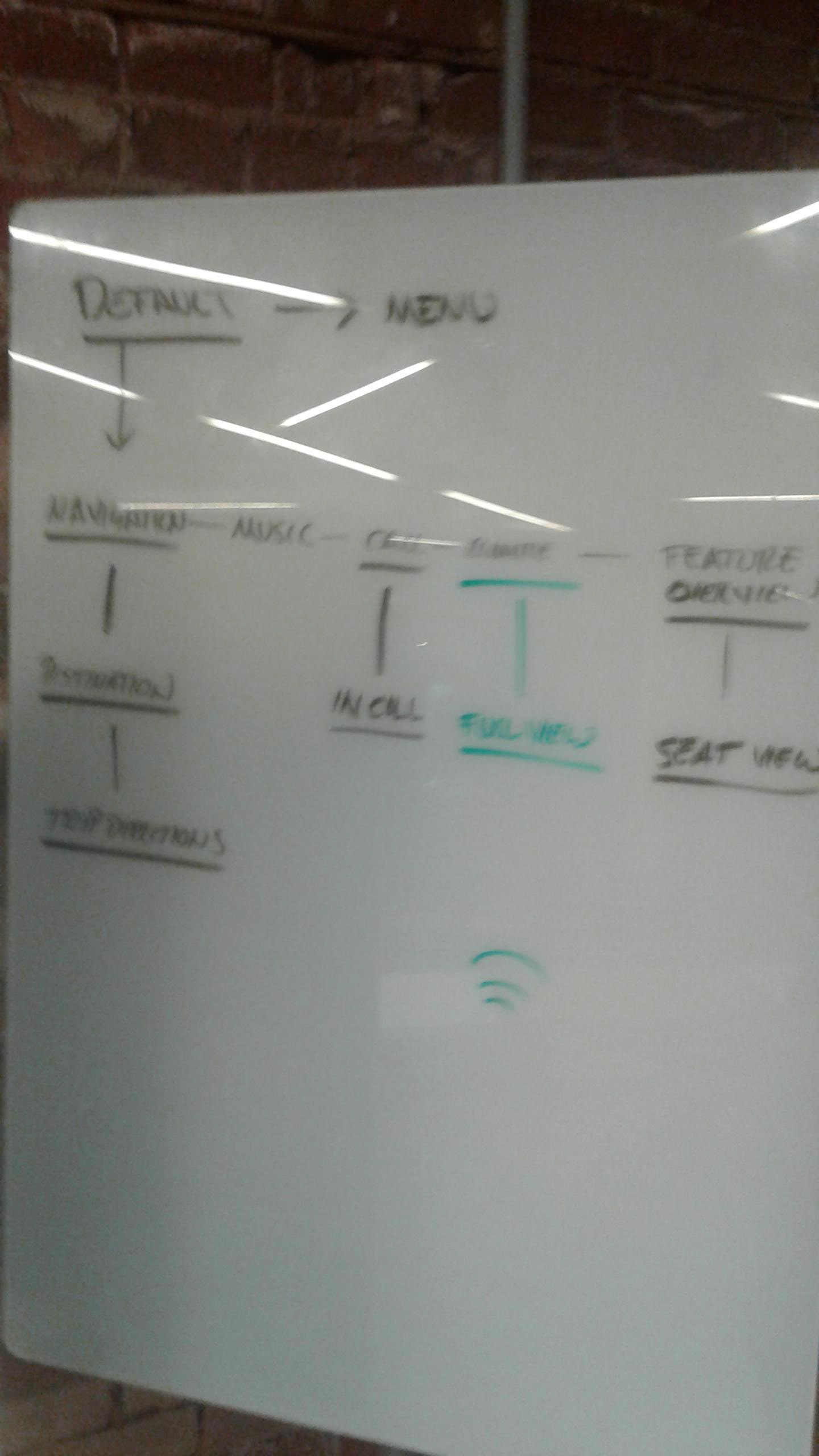
So one evening we got together so that we can work this out. The first issue I had was that I was essentially designing an entire operating system. With apps like Call, Navigation and many more. I was getting lost in the noise of having all these features. With his guidance I made a branching task flow, then wireframed screens on a whiteboard. I slowly started to understand the need for a less cluttered interface, but I also balanced the need for quick actions.
I learned here how to organize what I want to show in the demo. I was effectively designing an entire Operation System so I had trouble planning what to show with the time I had

Alex's big criticism was that it had way too much clutter. I however thought that it was necessary to have these gesture features. Once he learned what I wanted to do, he agreed, but I learned I needed to find a way to better communicate my work.
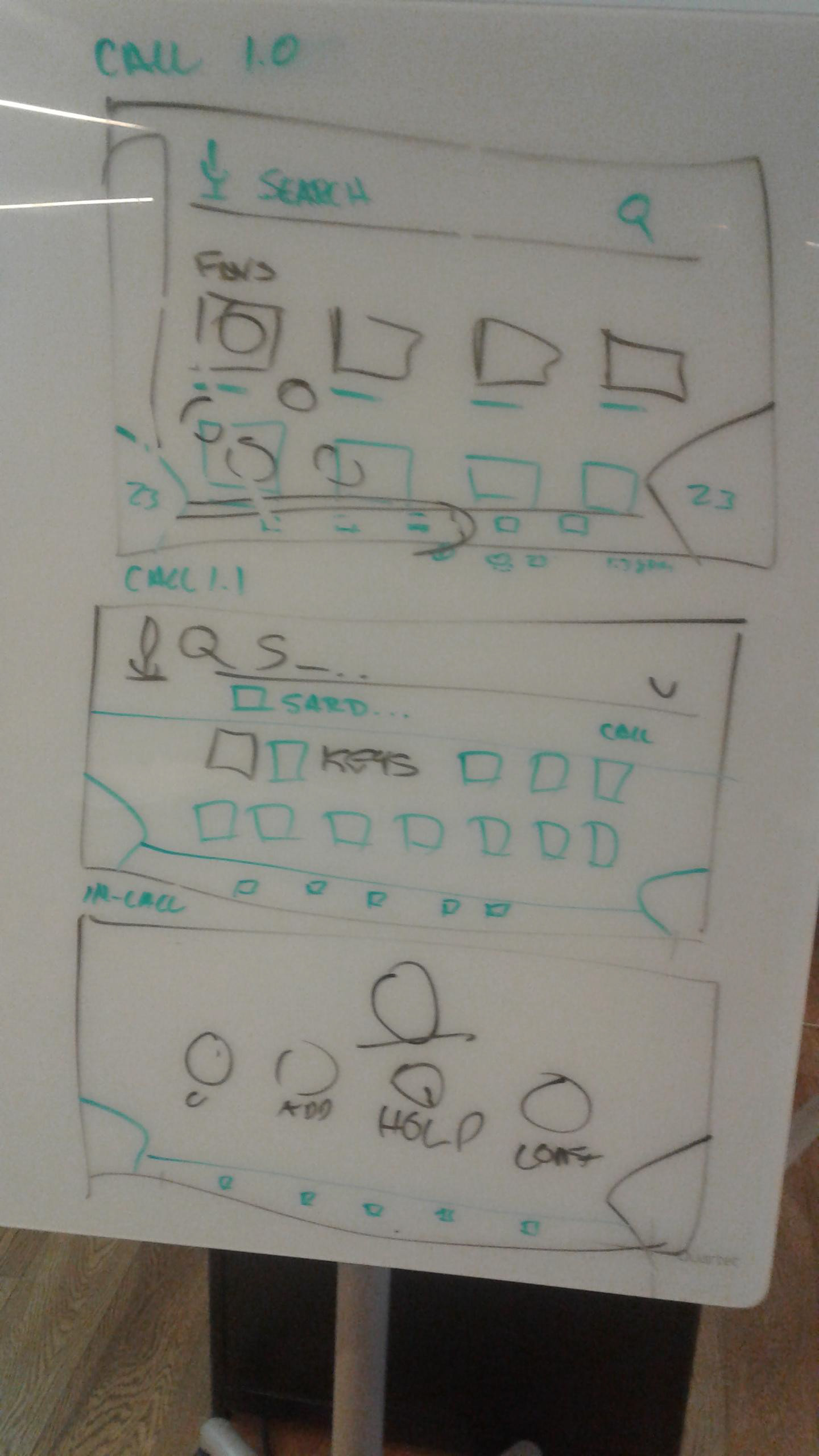
A call feature within the interface.

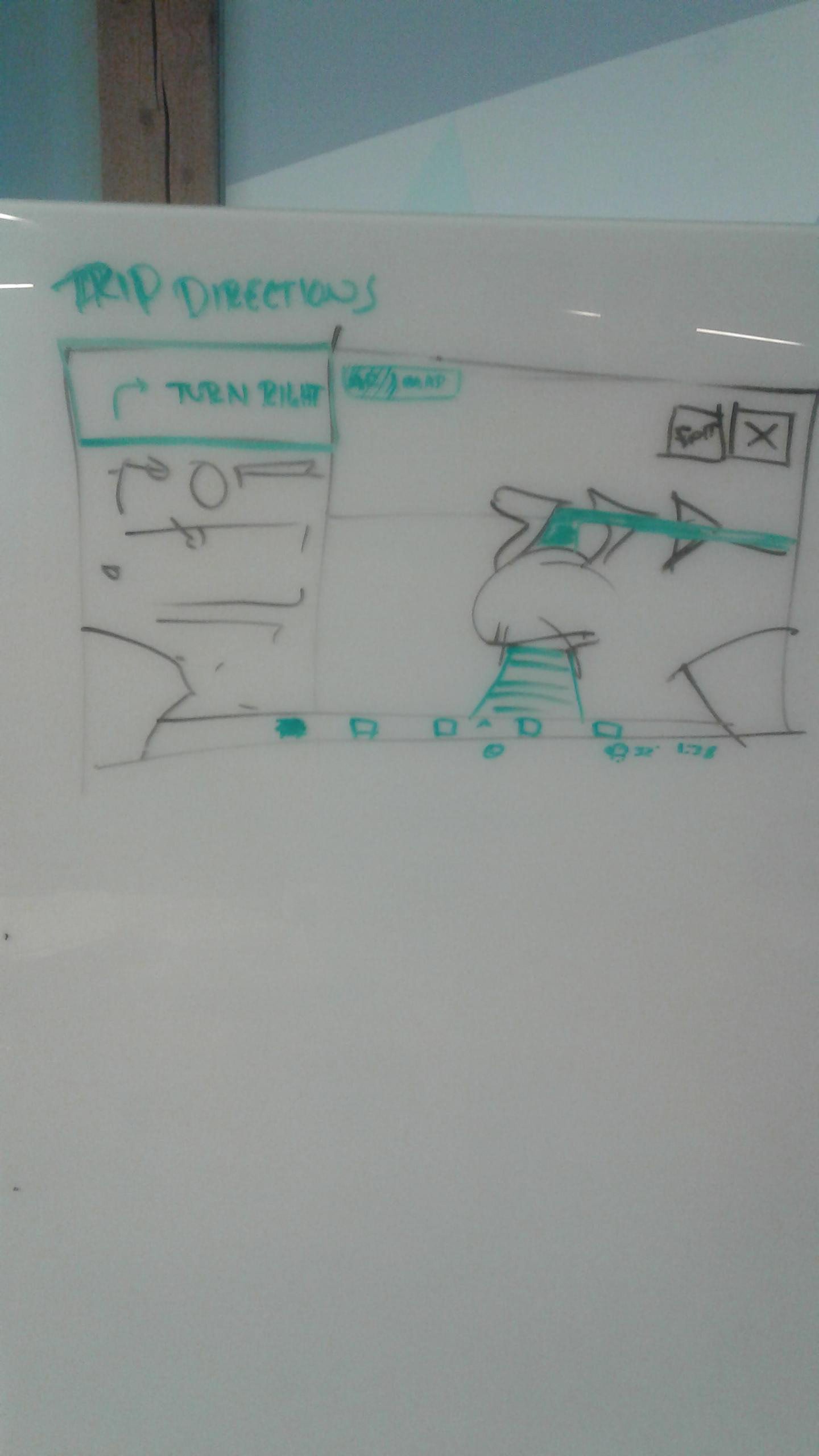
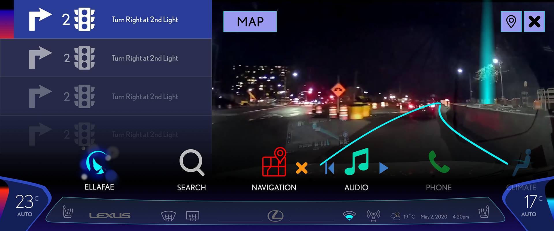
Trip Directions - On the passenger (right) side of the display presents a feed of the forward facing camera. AR arrows pop out to show your next turn when navigating.
Moodboard
I then made a series of moodboards. I wanted for this project to be unmistakenably Japanese, where Lexus and its parent company Toyota originated from. There are great traits associated with Japanese culture such as quality and hospitality that I really wanted to emulate once Brianna enters her Lexus. There is something called 'Omotenashi' in Japan, a term for a very Japanese take on hospitality. Essentially it means that the presentation is honest with nothing extra added to unnecessarily garnish the experience.

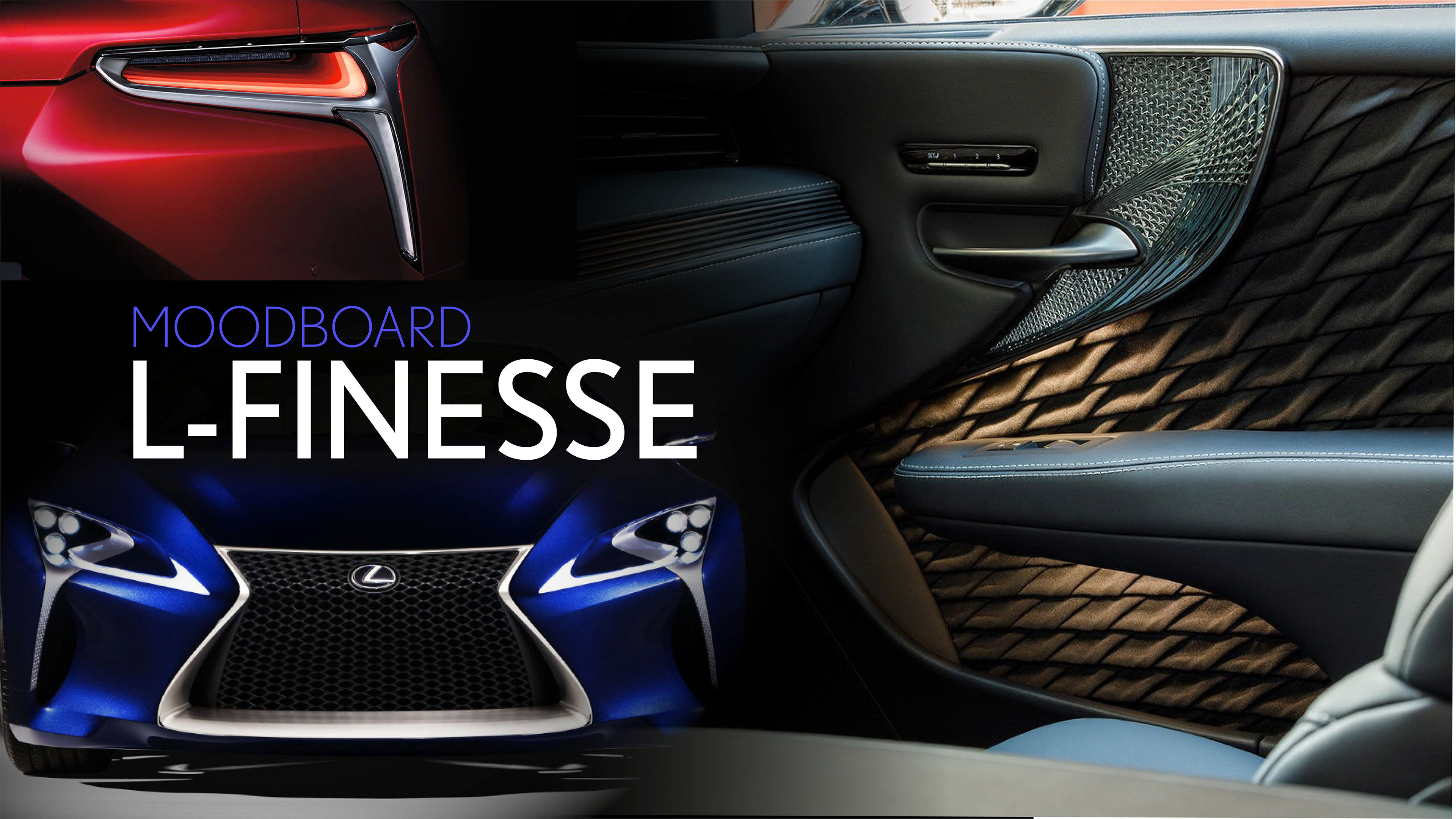
I looked at Lexus vehicles themselves to bring in the feel from the car into the infotainment system. Sharp L shapes show an extroverted design language that competes against the concept of Omotenashi. The former would need to be done with constraint to keep an harmonious User Interface.
Lastly the feel. Since its ability to not be blinding at night is extremely important, I decided to make this a priority. I'm only designing the infotainment UI here, not the interior design so I made this fit within current Lexus vehicles. Lexus focuses more on a trackpad interface and has surround over the screen blocking the sun during the day so there's less of a need to make it bright during then.
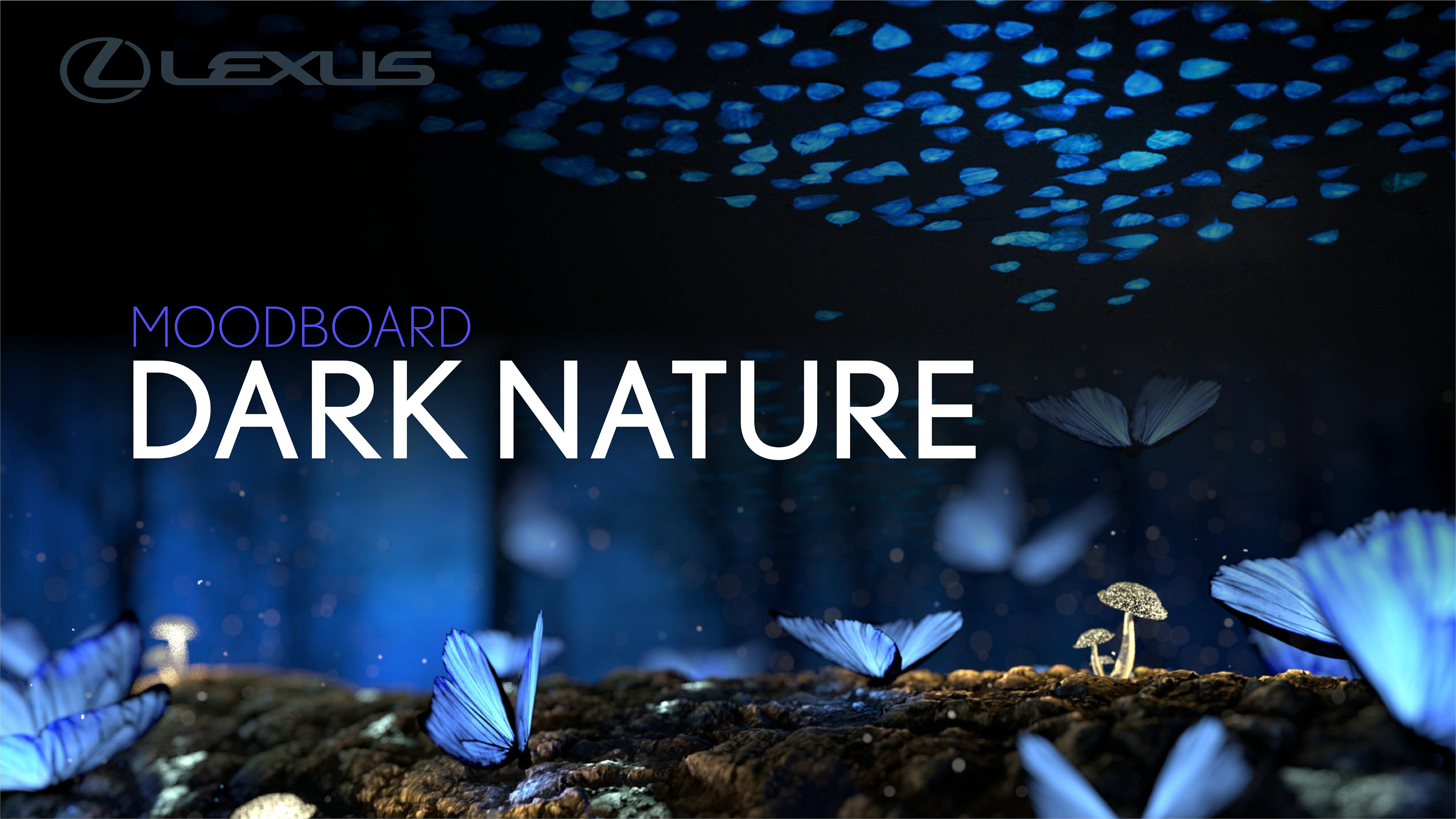
Following the nature theme I looked to nocturnal life. Lexus recently unveiled a special color, structural blue, a color present in the Morpho butterfly that is not created by pigment but instead the microscopic refraction of light. I explored this color as the basis of where the theming of this UI should go.
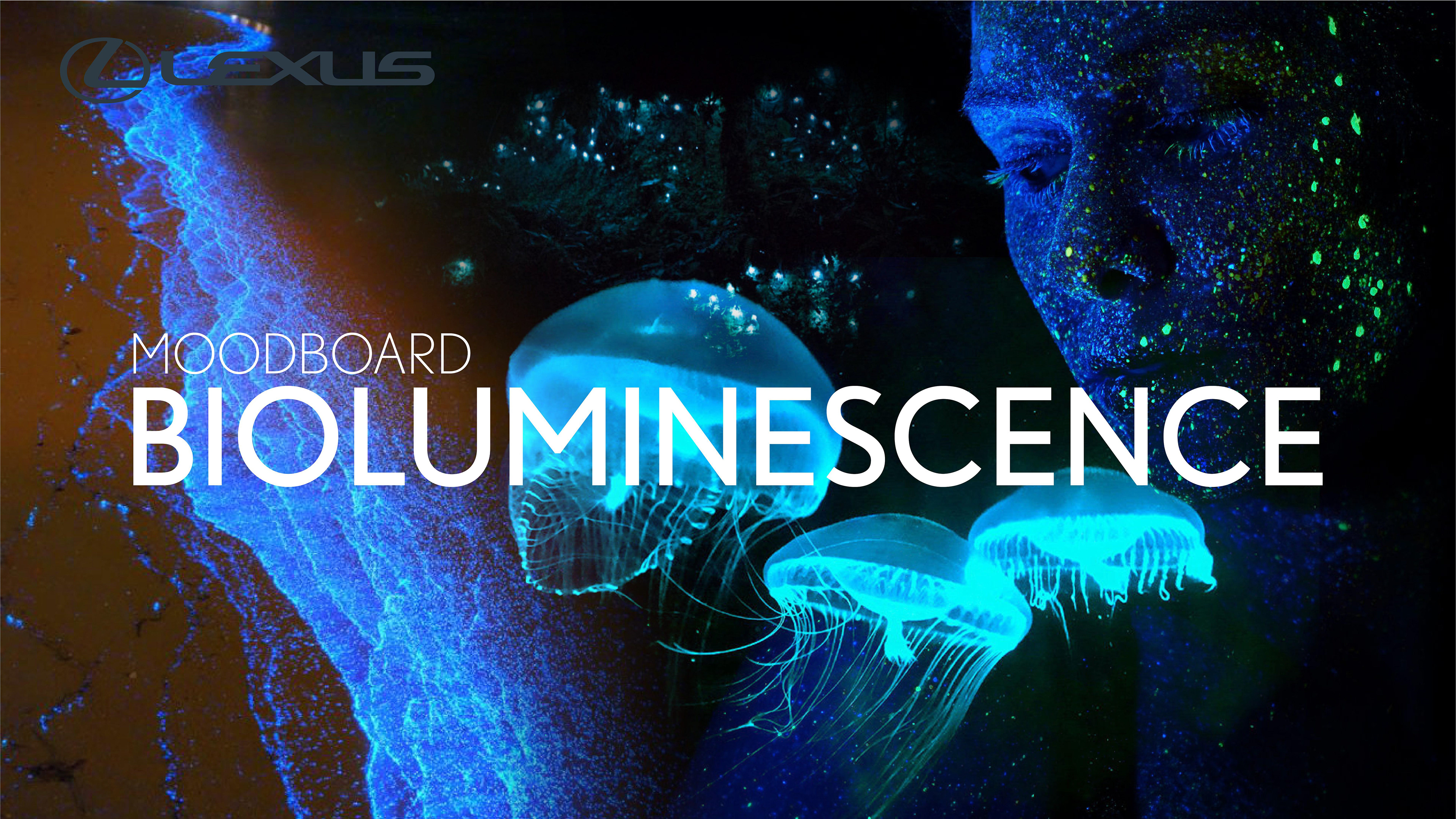
Following the nature theme I looked to nocturnal life. Lexus recently unveiled a special color, structural blue, a color present in the Morpho butterfly that is not created by pigment but instead the microscopic refraction of light. I explored this color as the basis of where the theming of this UI should go.

Final Design
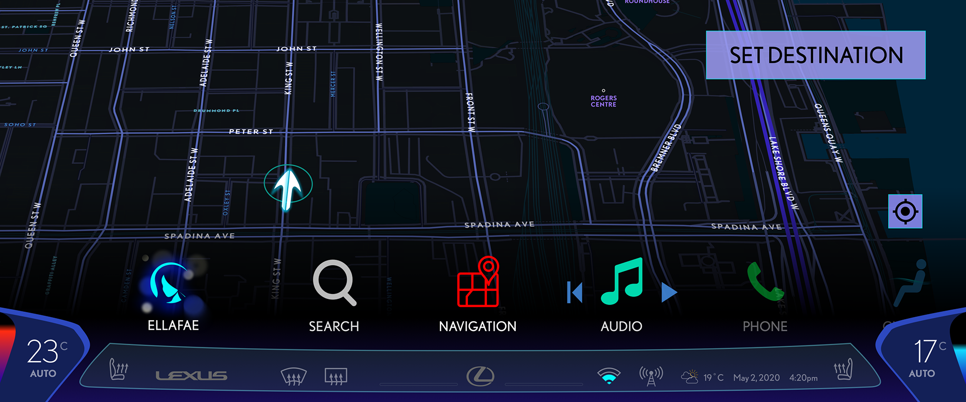
Home
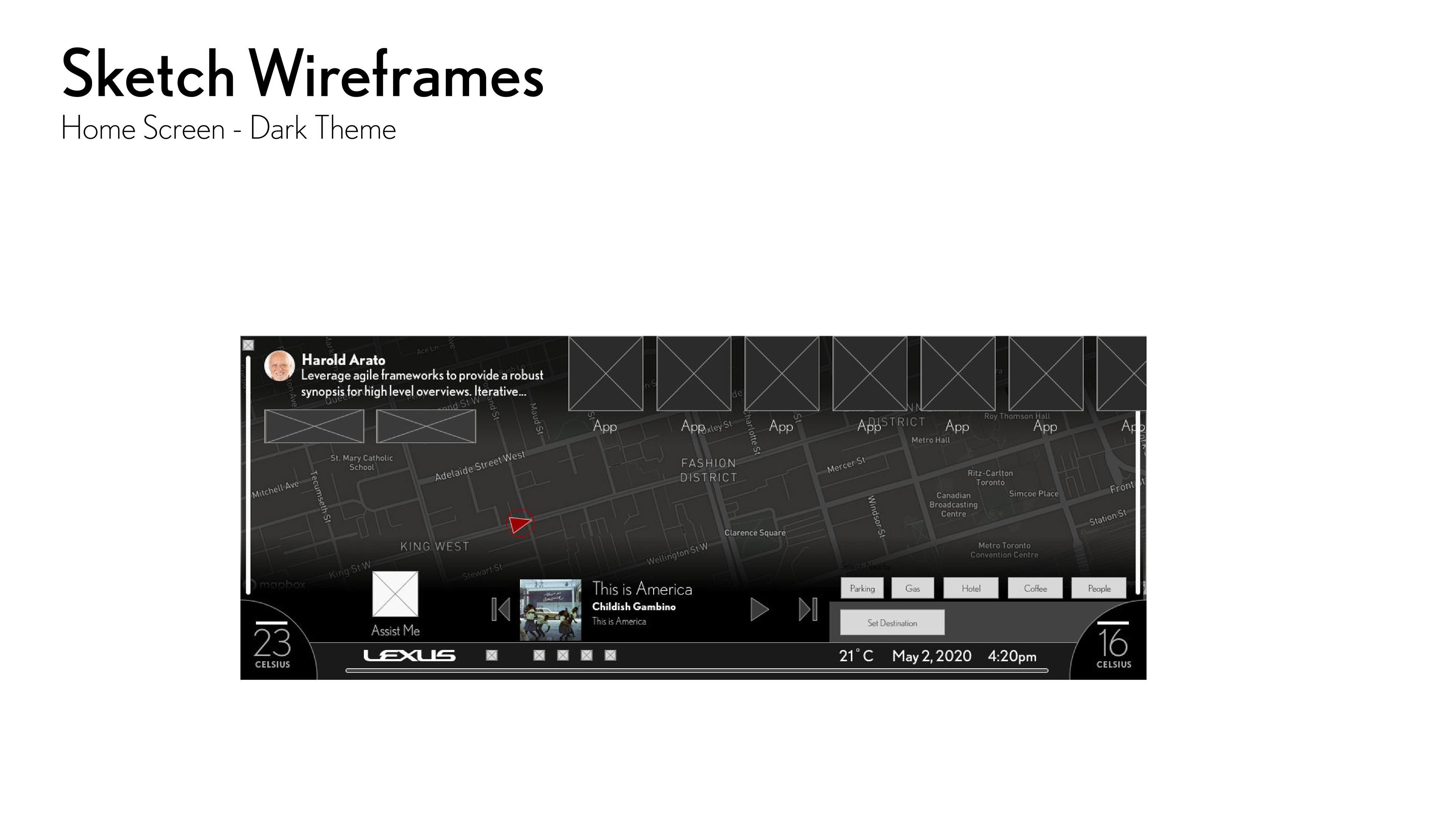
For the home screen, the background gives a preview of the app at the center (Navigation). This allows the driver to quickly see information such as location without having to 'enter' the app. Some like the Audio app has hotkeys that serve the same purpose. Contextual buttons are located in the top right hand side of the app (Set Destination) to allow the front passenger to use it while discouraging the driver from using when driving.
The map was made by customizing OpenStreetMap to fit the UI Design.
I created an AI voice assistant named 'Ellafae' after the pronunciation of LFA, a halo sports car made by Lexus. The original chosen name of the brand was going to be 'Alexis' but was tweaked to be not to similar to real names of people. 'Ellafae' seemed perfect as it sounds like an European's woman's name like 'Lexus' without actually being one.
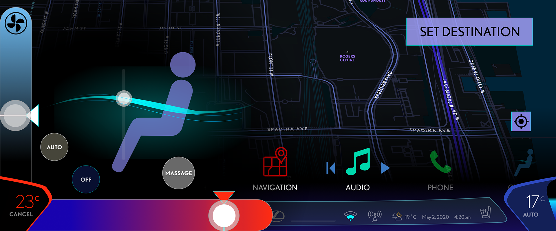
To control the HVAC (Heating, Ventilation, and Air-Conditioning) the user taps the button on the bottom corners.
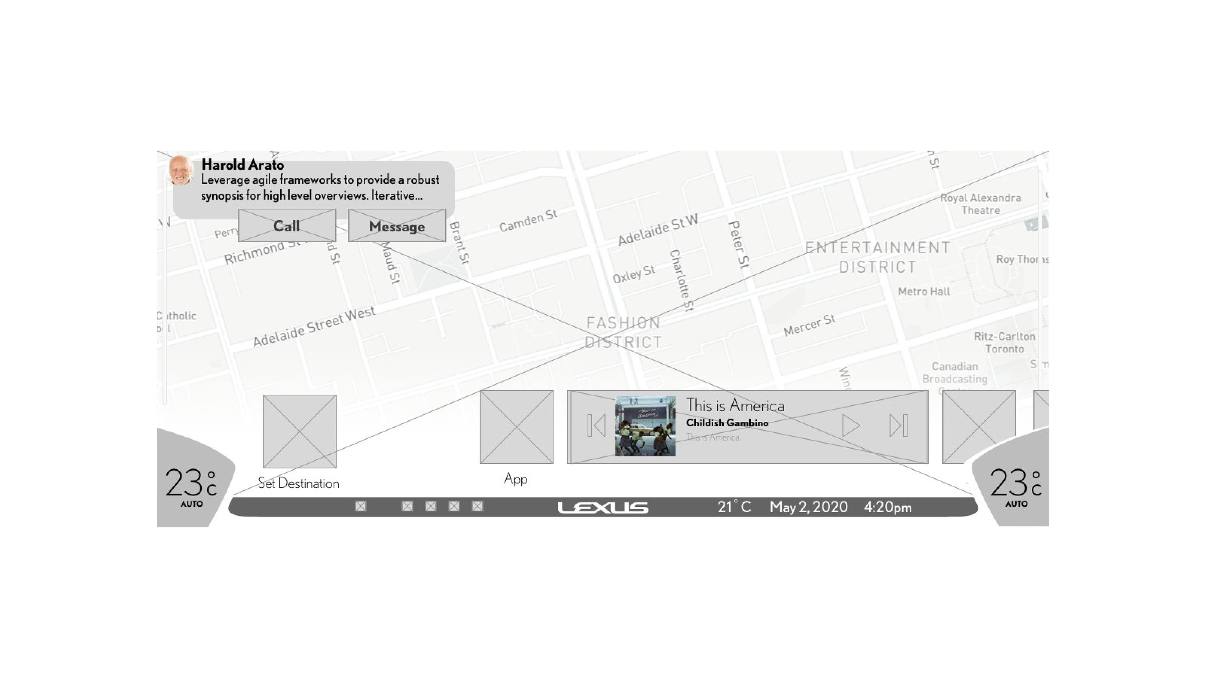
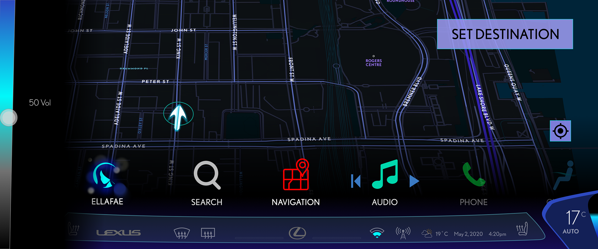
Volume Control
Click then drag on the vertical edges of the screen. This is available on both sides for easy reach for both driver and passenger. This is a hidden feature as Lexus vehicles typically have redundant physical controls on the steering wheel and the center stack.
HVAC controls
Tap the bottom corners to control the climate zone of the seat closest to each corner (Driver is left, passenger is right). Fan speed, temperature and position can be adjusted.
To adjust with speed, Tap and hold, then drag on the edge of the screen.
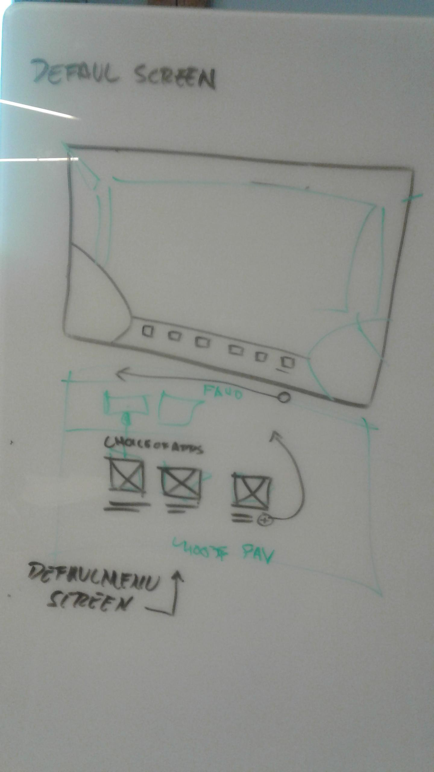
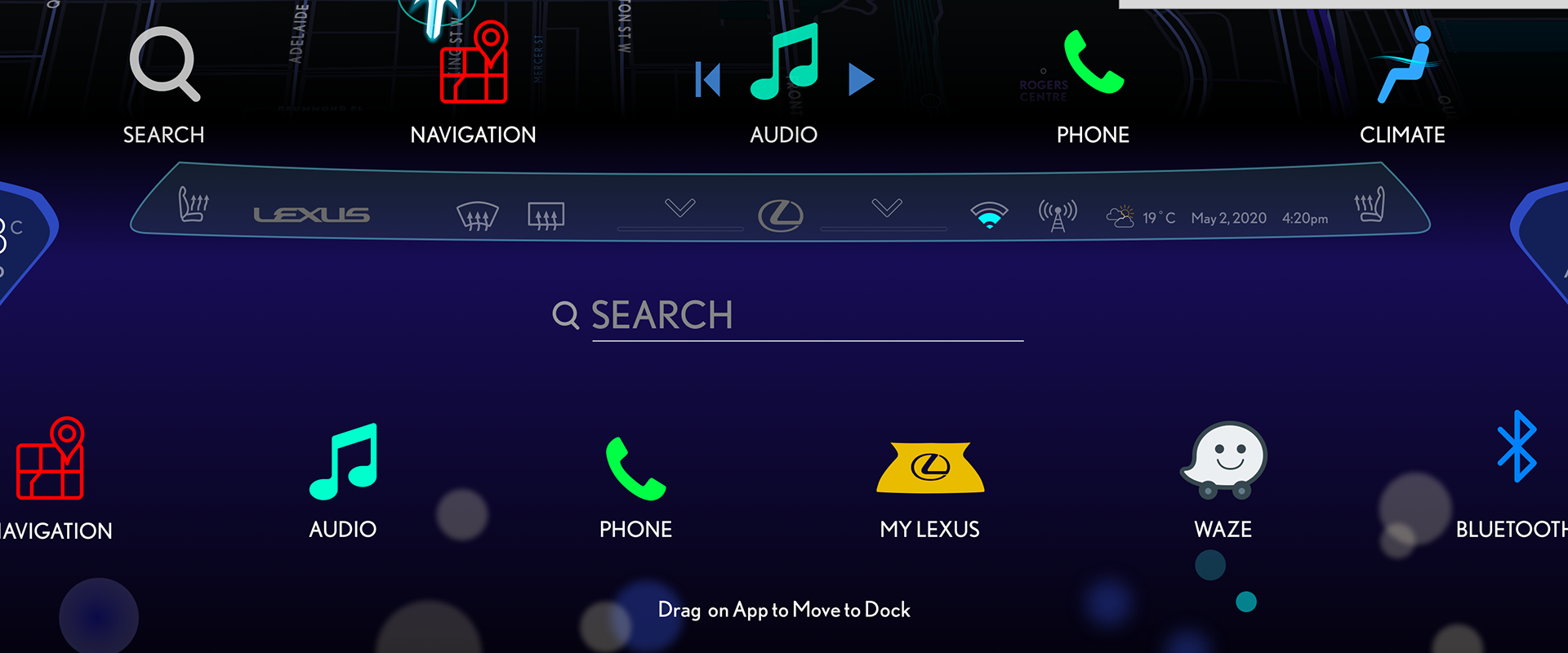
Swipe down or click Lexus Logo to access more apps
You can customize apps to appear on the dock by tap and dragging the preferred app on the bottom onto the top row.
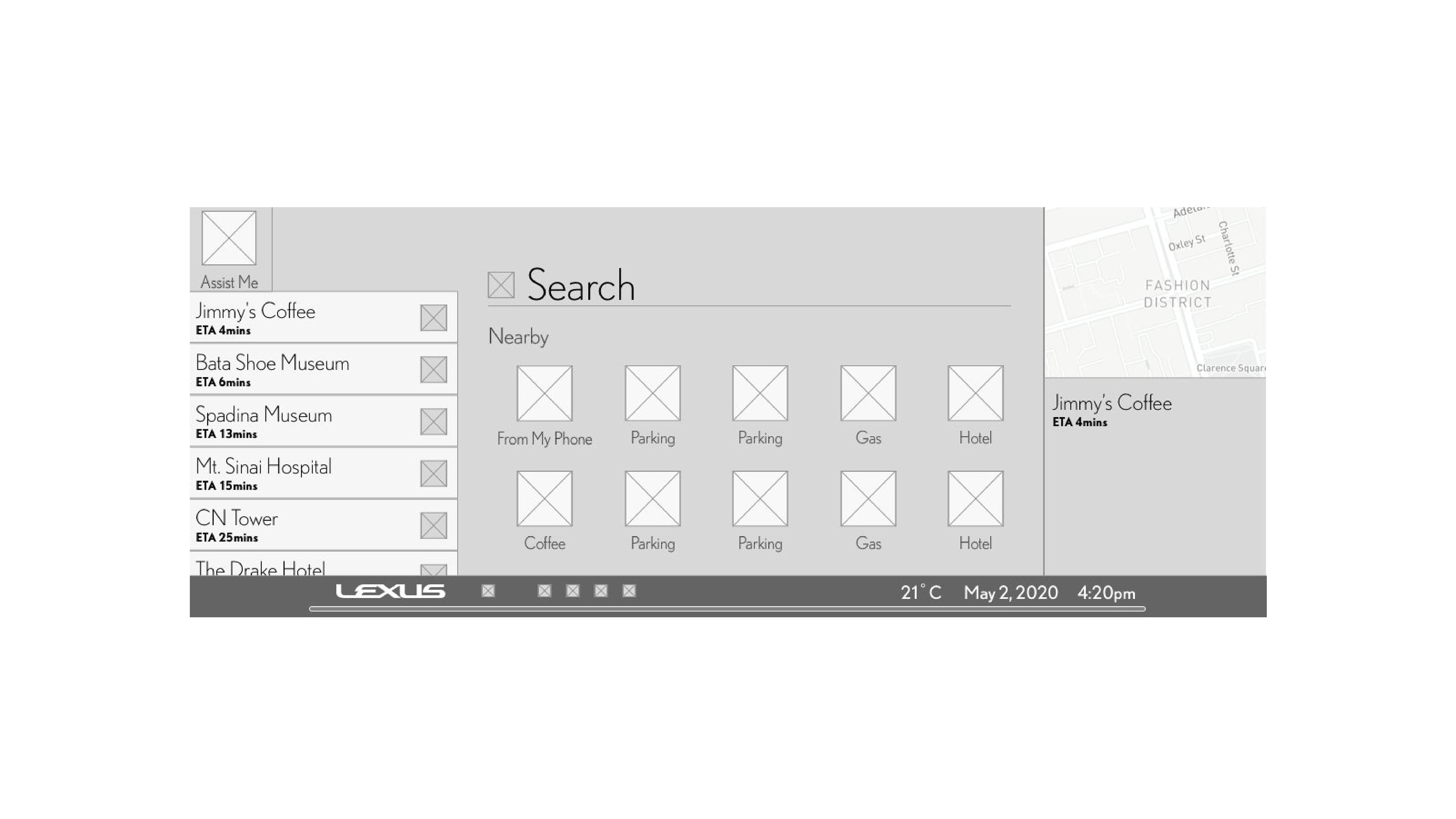
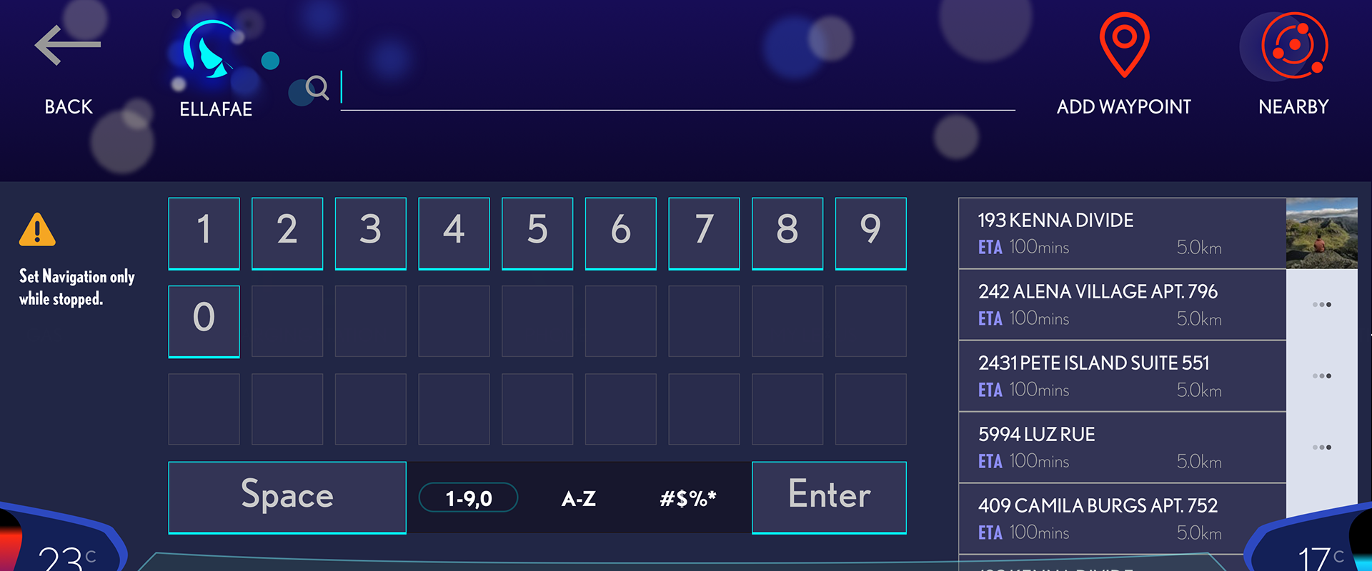
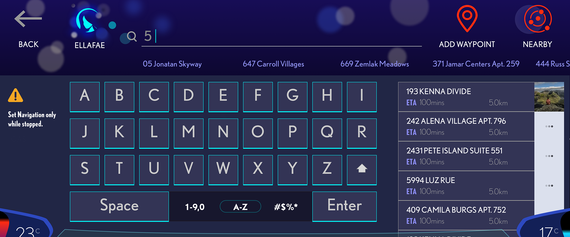
Set Destination
Tapping Search, the display is shown with easy to find numbering and characters. The search results appear as the user types their destination.
Directions
On the driver's side, immediate instructions are given with the immediate step placed on the top for quick readability. On the left of this cell a color countdown drops as the vehicle gets closer. The right side is the front view with Augmented Reality providing additional assistance in navigation.

Prototype
Next Steps
I would really like to try this prototype in an actual vehicle, but logistically it would be quite difficult to user test this in the typical setting - while driving. I also built this to fit dark mode, but I would like to test this in bright environments such as at sunrise to see if a light mode is also needed. Lexus vehicles tend to cover their infotainment screens in a shroud.
I learned a great deal from this project, from properly organizing your prototype by tasks to customizing OpenStreetMap to get the map to fit the UI.